


 Silene is a collaboration between @epiTune and @Shiiro0 <3
Post your gens down below! I will ⚡ images I like! Have fun! <3
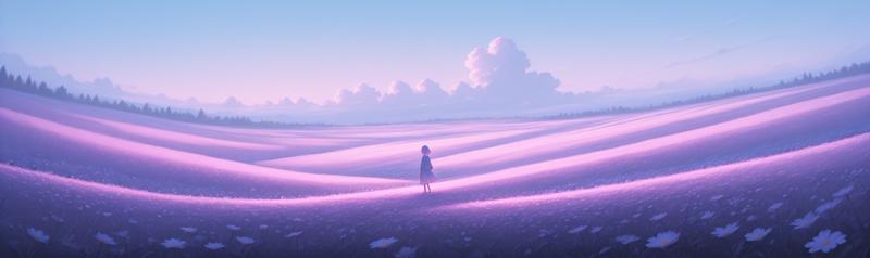
Silene is a checkpoint aiming to bring forth the strengths of Illustrious 1.0 while also providing a more stable and consistent base for generating.
832x1216is our recommended lower-end resolution1024x1496is stable and is recommended for anyone that can generate with it - it helps bring out richer and more crisp details in your generations1400x2048is the highest resolution we recommend trying - it can produce crisp and delightful images but is less stable and can require trying more seeds
We believe that in future versions of Silene we can improve the high resolution stability even further, stay tuned! Silene makes the same stylistic trade-offs as Koki'o - aiming for a pleasing and consistent style while allowing explicit prompting to take over when needed. This expressivity is something we will aim to improve in future versions of Silene - if you run into limitations, try Koki'o!
Another benefit of the Illustrious 1.0 base is better natural language prompting. While it can not be compared to models like SD3/Flux - it can definitely be very helpful for adding oft needed specificity. This is especially useful when a certain concept, pose, or detail does not have a well recognized Danbooru tag.
Simple examples being index finger on tongue or both hands on neck.
Your experience prompting earlier Illustrious models should transfer well - Illustrious 1.0 based models should ideally only understand tags better.
Our recommendations for negative tags remain the same as for Koki'o: anatomical nonsense, artistic error, bad anatomy, bad arm, bad aspect ratio, bad ass, bad face, bad feet, bad hands, bad knees, bad leg, bad neck, bad perspective, bad proportions, bad reflection, bad vulva, different reflection, extra arms, extra digits, extra eyes, extra faces, extra legs, extra pupils, fewer digits, oversized limbs, wrong foot, wrong hand
Try to tailor what negative tags you use to your specific needs rather than always including them all.
A trimmed down version that's suitable for general use is: anatomical nonsense, artistic error, bad anatomy
These should be used in tandem with staple negative tags such as: worst quality, bad quality, low quality, lowres
On the flip side, recommended positive tags are: incredibly absurdres, highres, masterpiece, newest
You could also consider various combinations of tags such as: detailed background, depth of field, foreshortening, dark theme, light theme
But do note that certain art styles benefit from omitting masterpiece and newest.
These tags heavily lean into the refined and modern digital look, if you want to generate watercolor these might work against you.
Likewise, if you're going for a retro look, avoid newest. For a traditional art style you might want to include tags such as: traditional media, painterly, good quality, average quality
Some tags that are useful for steering away from the default anime look include:
POS: painterly, no lineart, blending
NEG: flat color, high contrast, anime coloring, limited palette, outline, ligne claire, lineart, oekaki, jaggy lines, dithering, pixel art, monochrome, greyscale, sketch, anime screenshot
Art Mediums vs Quality Tags - Illustrious Year Tags
Recommended settings: Steps: 30-40 Scale: 4-6
Sampler: Euler A OR DPM++ 2M
Description
FAQ
Comments (12)
Oh damn Illustrious 1.0 so fast! Have you tried this with your various 0.1 LoRAs? How does it handle them?
Yes most of them from what i've tested,but maybe the weight need to be adjusted :)
an I1 merge that isn't doing anything cursed with my workflow ^^
much appreciated, awesome work as always
What resolutions do you recommend for landscape generations?
The resolutions listed in the model descriptions are very rough guidelines and the model should be quite flexible - think of them as "quantify of pixels", so low, medium, and large. The exact resolution you can vary quite a lot actually. I've been able to use many different aspect ratios and various resolutions.
It is difficult to find the expected pattern, but as the author says, [But do note that certain art styles benefit from omitting masterpiece and newest.] is not a bad option. Maybe it is a model with a wide range of possibilities that I just don't know how to use.
We expect the interactions from the Illustrious 1.0 text encoders (that are pure and unmerged in this v1 release) and other parts of the unet to interact better in future versions. So expect rough edges to be ironed out with future refinement.
Super artistic support and the resolution is really insane. Truly amazing work and something special in the model jungle :) *thumbs up
I haven't even started using your checkpoints yet. I just want to say beforehand, I appreciate you for the in-depth descriptions you give on your models. Stuff like this can take off hours of trial and error. I didn't even know about negative prompts being more useful in Il models.
Tip: I was using Euler A for a while but found the results to have an over-exposed look. (Bright tones too bright). If you have this problem, DPM++2M is your friend.
Using Karras scheduler can make Euler A work with this model.
太棒了baby,我喜欢😘😘😘😘