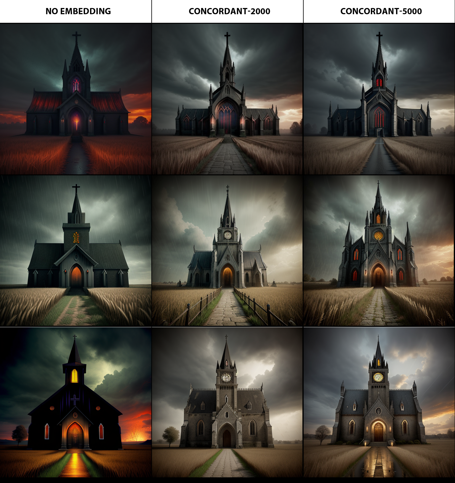
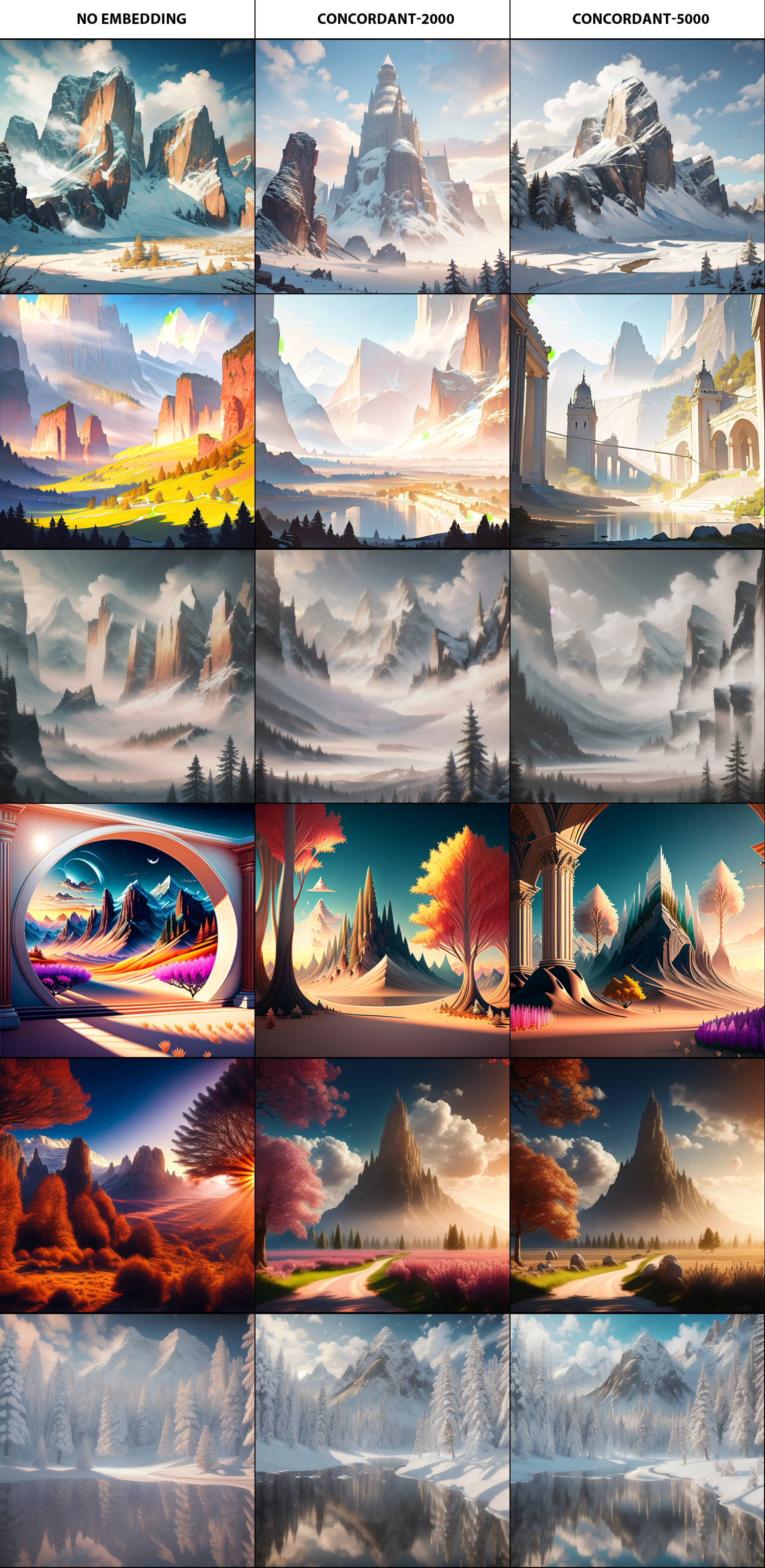
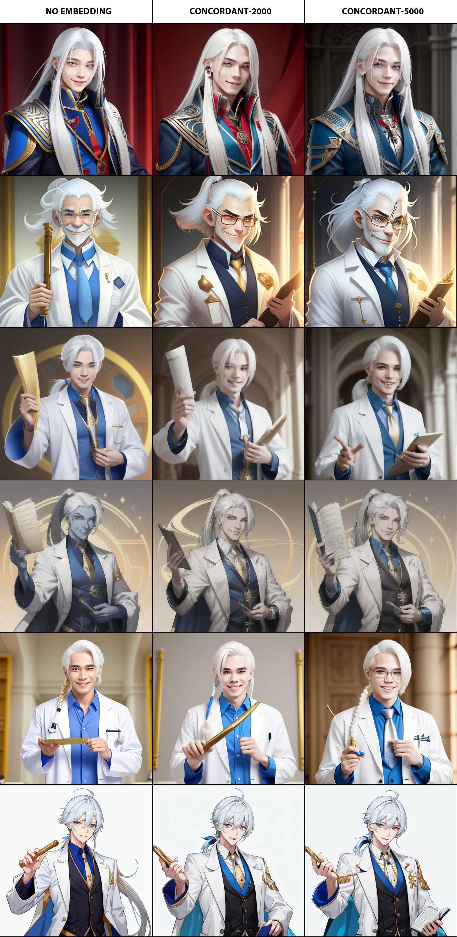
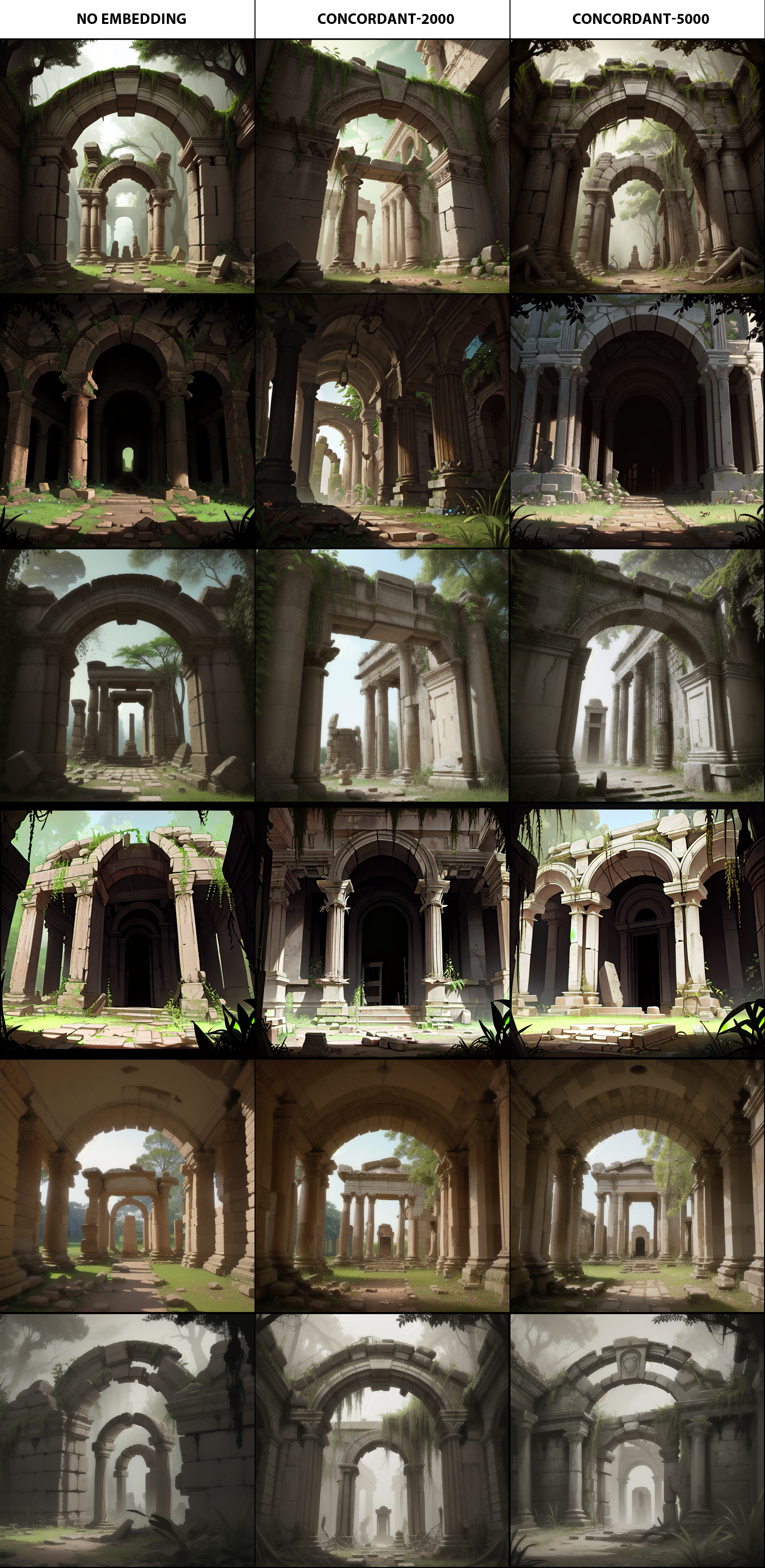
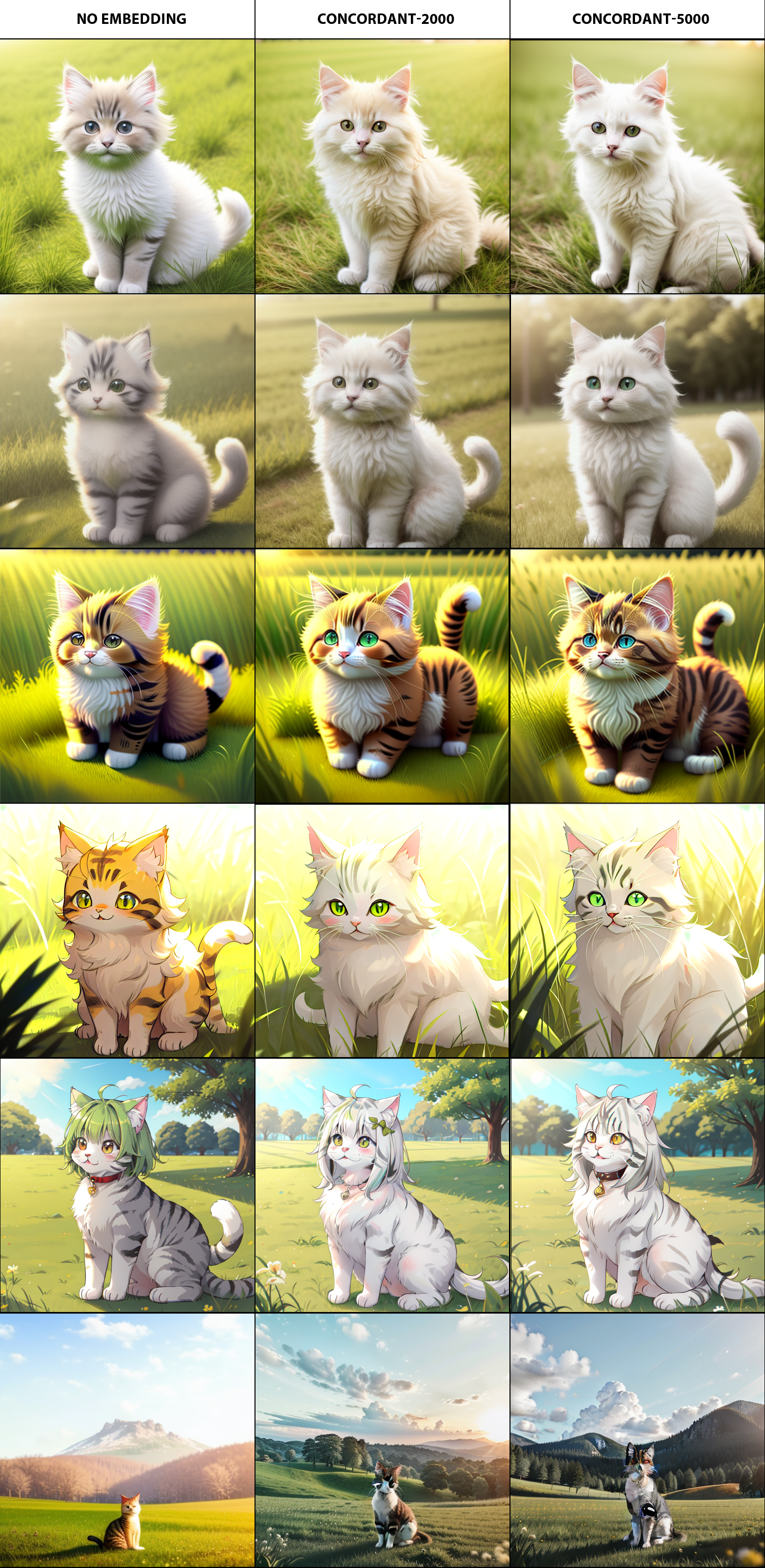
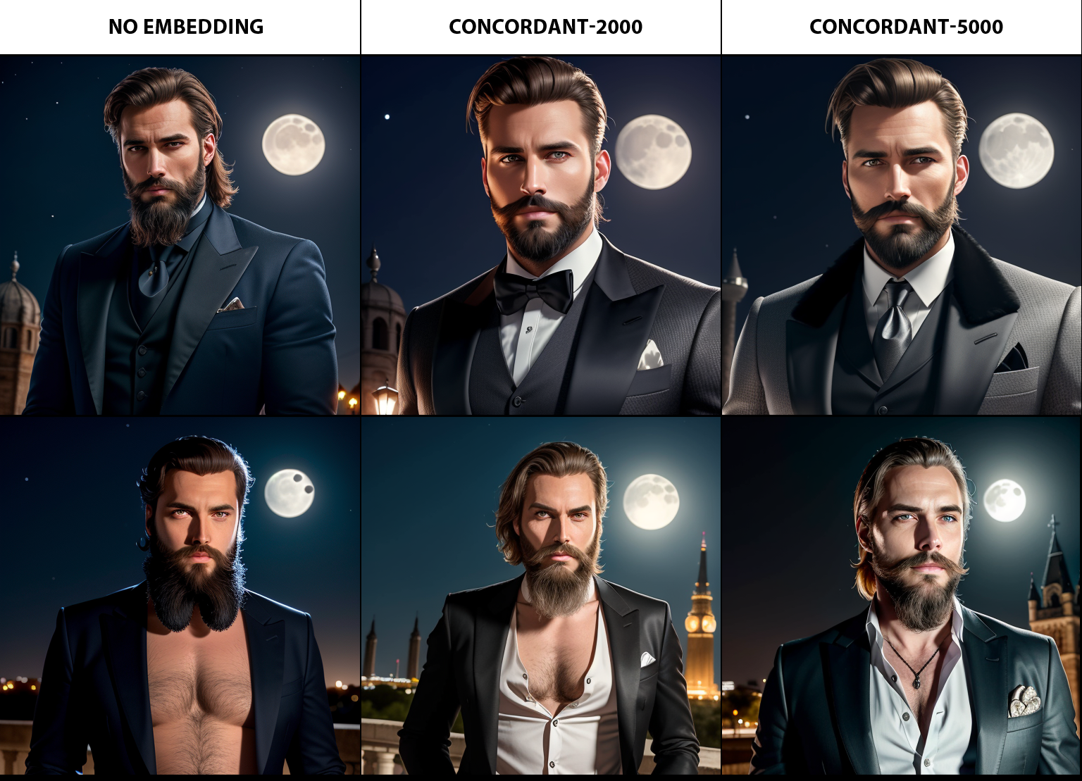
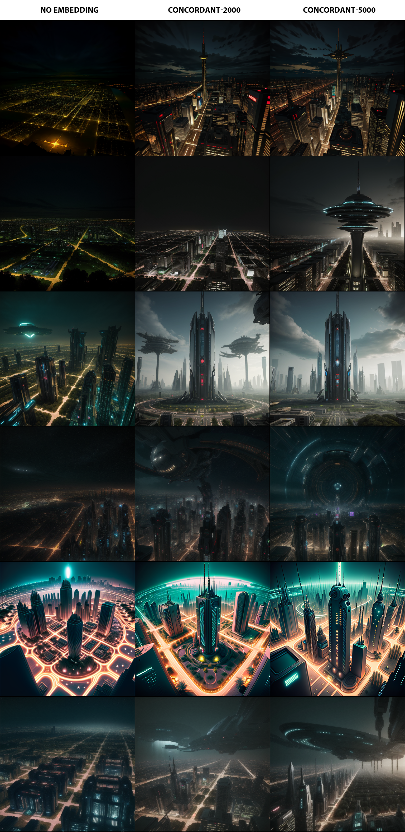
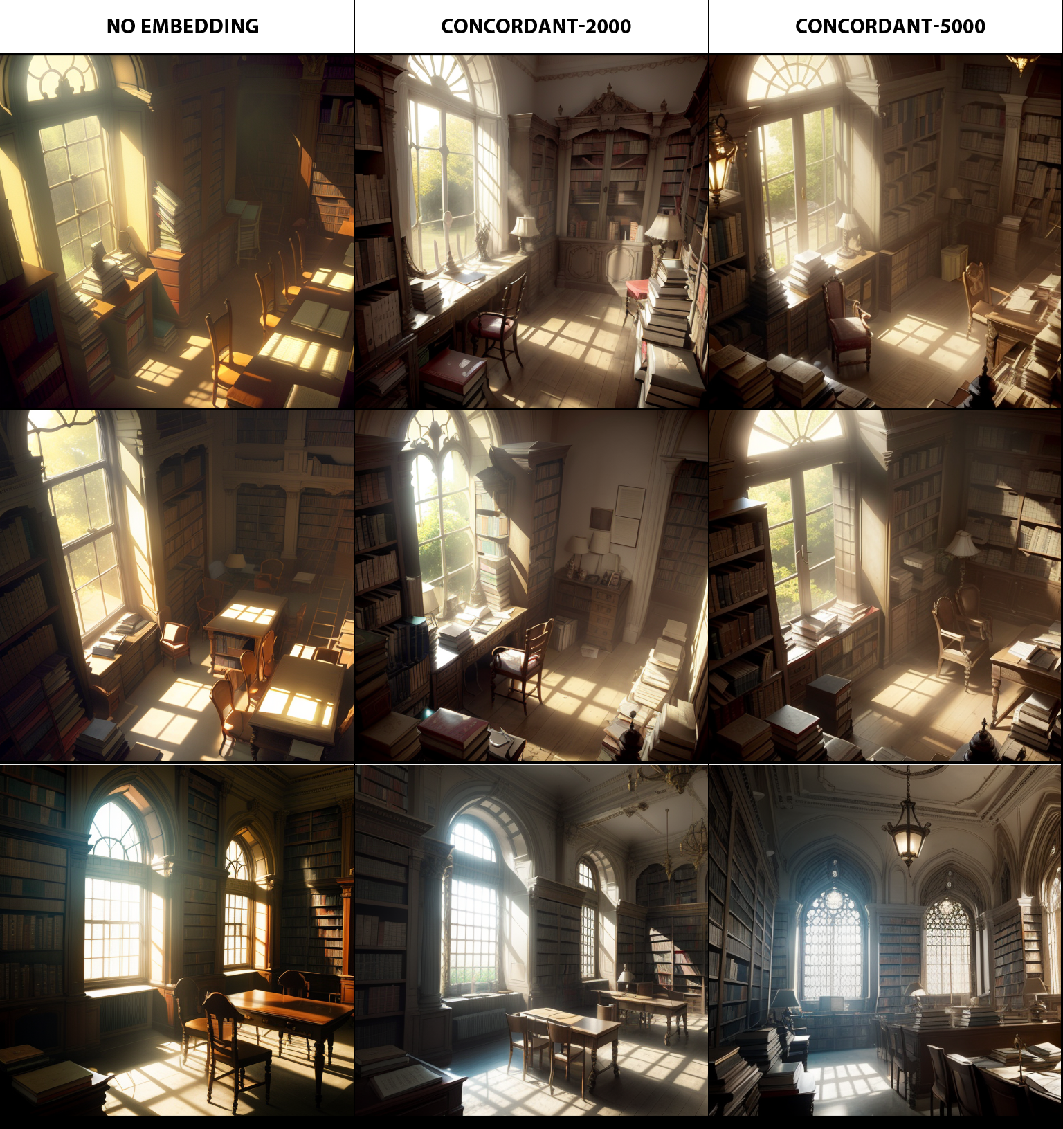
Concordant is another TE negative I made for myself as an experiment but also again figured others might like it's effects.
It won't increase colour or make things more colourful, but instead average out colours without making the image washed out (so, no hyper contrast colours but also less drab greys unless intentional).
It also does add detail, but in a more neutral way that doesn't override style. The training data has 0 people/animals/direct subjects and instead is based entirely on abstract concepts to push images away from concordant layouts and colours (hence the name). The effects work better on semi-real models, but tests were done over multiple models.
2 types, depending on the training steps, as they both give slightly different results. The 5k one also is likely to generate backgrounds instead of blank/plain/simple ones and that helps me a lot as rarely do I want just a blank colour.
All of the tests are without VAE so some washed out images are due to the models wanting VAE. Also no post processing or fixes.
Description
The 5000 step version
FAQ
Comments (5)
Looking forward to playing around with your Embedding.
I noticed that the filename is the same for both the 2000 and the 5000.
Obviously I will change the file names for myself so I can try both, just wanted to give you a heads up in case you didn't mean for it to be that way.
Whoops, that would be likely CivitAI changing it on upload since it's still different on my local files. Weird! Thanks for the heads up!
Question: (ELI5) how would this be different from GnarlySick? https://civitai.com/models/102003/gnarlysick-negative-embedding
Ah missed this comment, sorry about that. Gnarlysick tends to make colours more bold and sharpen the images, as it was trained on very dull and blurry photos that are off centre. It won't add detail usually. Due to it's training data, it is more suited for non-abstract subjects, people, animals.
This one doesn't tend to change the sharpness or contrast much but will try to balance the colours more, even softening high-contrast as well as help with general composition (again, due to how the data was set up). It has a greater chance to increase details, and also isn't as "subject" focused, thus has less style impact.
@hobolyra if that is true then what are the other types of color adjustments? Sorry I am not a photographer or photo editor, kinda need some pointers (brightness, contrast, sharpness, saturation) and some models that handles each