KonPaEvo
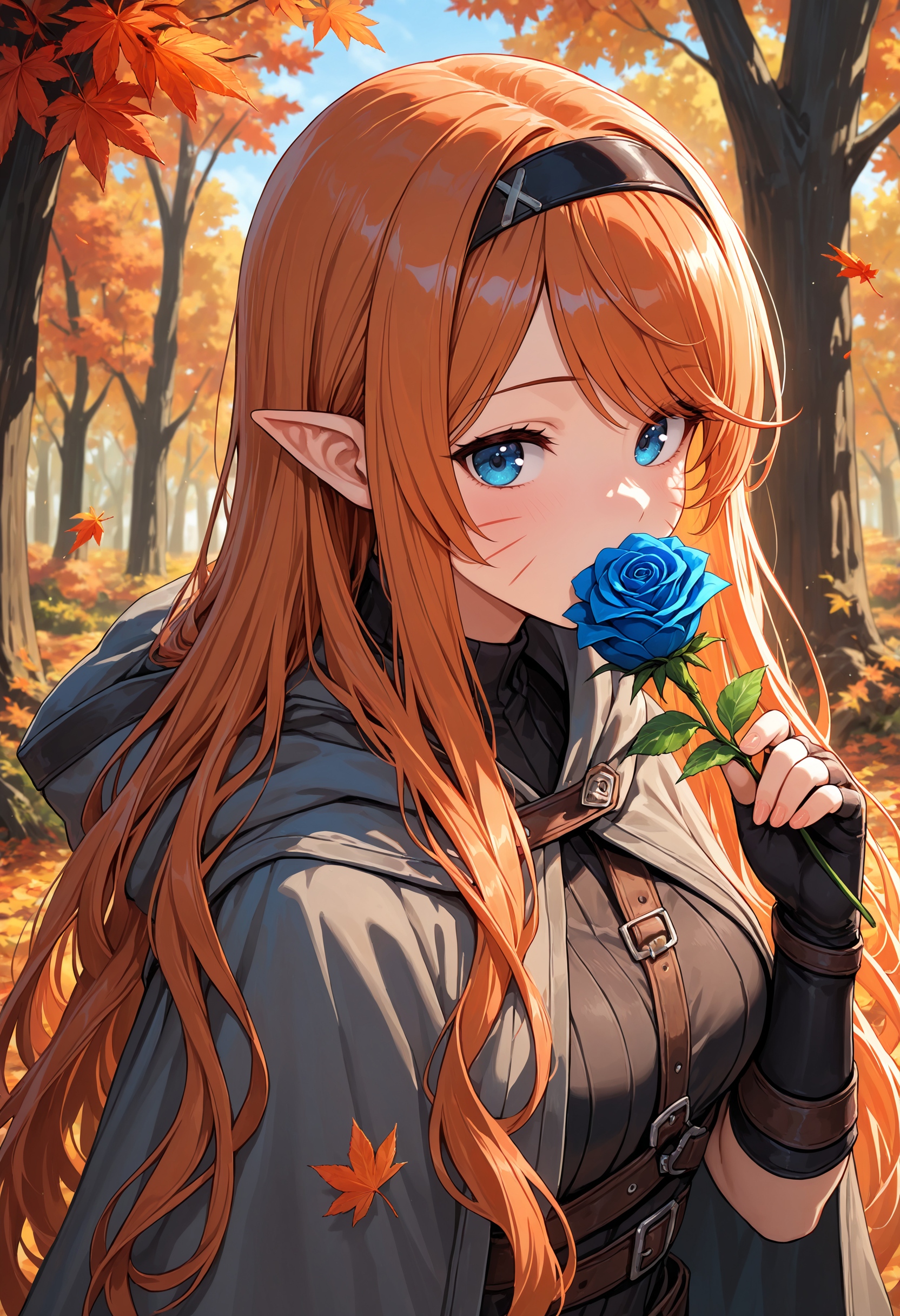
KonpaEvo Mix is supposed to create a clean and vibrant base style. Artist and style tags should still work perfectly fine.
Use with CFG +-2.5 | range of 1.5-3.5 seems good, go higher for more vibrancy (and also brightness) (Comparison image CFG 1-6)
4S Lightning Lora @ 8 steps | 8S PCM Lora @ 16 steps
PAG scale @ 1.6 @ CFG ~2 (Perturbed Attention Guidance | thanks @fhaifhai)
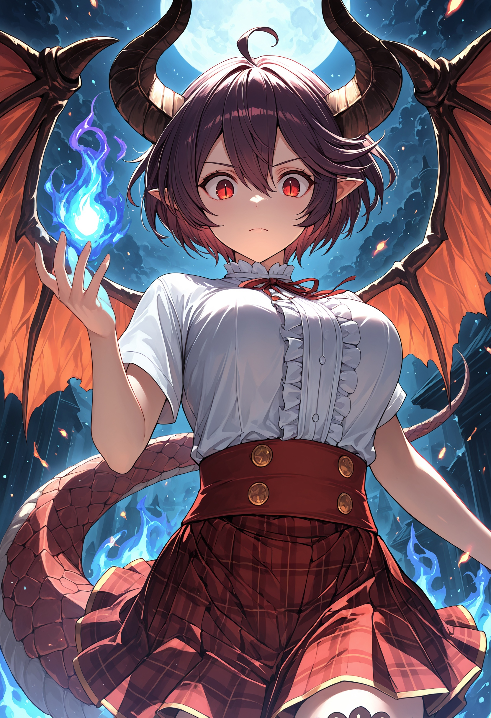
Positive prompt masterpiece, best quality, very awa + optional artist/style tag(s) | very awa makes images more artistic
Negative prompt I personally use:lowres, worst quality, low quality, simple background, bad anatomy, bad hands, signature, text, watermark
Settings:
Sampler: Euler a beta | Deis beta | DPM++ 2M (SDE)
Steps: ~24 | 4S Lightning Lora @ 8 steps | 8S PCM Lora @ 16 steps
CFG: 1.5-3.5 | 3.5+ for more vibrancy (& brightness) | ~2 for PAG @ 1.6
v1.0 Merge recipe (simple | see "About this version" for subsequent release's recipes):
Base (NoobAI XL 1.0 EPS): noobEvo v1 by @advokat for style/vibrancy
KonbiniMix v1 by @Shiiro0 merged in ~40% OUT blocks for style (mainly outer blocks)
PaSanctuary v2.5 by @FallenIncursio merged in ~38% IN Blocks for what I think should be backgrounds/composition (except IN6 because IN6 sucked for this merge; introduced extremely heavy headlighting)
v1.0 Merge recipe "extended": https://ibb.co/jvmFSpP
Clip: 60% noobEvo, 40% PaSanctuary v2.5
Please include the merge recipe for any subsequent merges.
New versions on this model page will include the merge recipe in "About this version"
Note about CFG 1 and samplers:
SDE samplers like DPM++ 2M SDE help quite well with the paleness. DPM++ SDE however is twice as slow as euler so I recommend against using that one. Remember to use Karras scheduler because normal doesn't seem to work
If you want to use Euler A with CFG 1: Use Luna XL VAE or Hi-Res Fix with Hi-Res Fix CFG at 4-8 can bring back vibrancy to the image, itll be slower than Hi-Res fixing at cfg 1 but the initial gen will be faster, seems worth it to me if you don't want to use SDE samplers.
KonpaEvo name origin: Konbinimix Pasanactuary noobEvo (also somewhat intended: konpa, jap. コンパ, supposedly is a type of drinking party so it kinda fits like konbini, convenience store)
Description
Changed some small stuff that I personally would call improvements:
Slightly better backgrounds and background detail
possibly slightly better prompt adherence (shiny skin in neg works better now as example)
possibly slightly better (mainly) character knowledge
glow/light bounces were very slightly reduced as a result
If you feel that this update is worse than v1.0 then please let me know
Also, merry xmas
Merge recipe: https://ibb.co/K0ytt7r
FAQ
Comments (23)
criminally underrated checkpoint
LETSGOOOOO MY NEW STANDARD !
i'll make some tests.
is this the exact same receipe or you changed some of the original model ? (Pansanctuary update for example)
I just changed clip to Noob 1.1 a bit as well as OUT 0. Nothing else unless I'm forgetting something
You can see the recipe in form of comfy nodes in the link in "About this version"
I didn't want to merge in PaSanc because it has a huge bias towards specific body features which are hard to prompt out. It's also been the same with this model: double-parted bangs are practically default unless you put them in negative, which isn't that bad, but if i had merged in PaSanc v4 in it'd very likely look/feel similar to AutismMix maybe in breast shape and be very biased towards a specific shape and especially wide waist, thick thighs etc. I assume this is to train out the loli bias that noob can have which is good, but I think the resulting bias isn't that great
Could also be I'm using PaSanc v4 wrong but I couldn't manage to prompt the body shape bias away. It felt like I was using an sd1.5 model trained on a small dataset/is a lora into checkpoint merge
PaSanc v2.5 doesn't have as much bias as v4 so it just stayed like that
I want/wanted a model with imo good base style without requiring all the huge amount of quality tag BS a lot of models recommend which obviously also work on Konpa, if you were wondering.
I'm not sure if Konpa even does what I originally wanted considering I uploaded it under the impression that it produced extremely vibrant but also bright images which i thought were just a noob thing and I couldn't fix but it was me not realizing NoobEvo was a low cfg model (well it didnt state so on the model page either but i didnt test either lol, advokat himself probably didnt know it worked better at low cfg either idk)
Alright I did enough yapping, if pieces of the text look out of place it's because i'm trying to fix my sleep schedule
Also I should add: If I were to update the underlying model like PaSanc it'd probably be a v2 since PaSanc v4 is quite different from previous versions. It has a very defined style in many situations (which im not too worry about), too defined for my tastes even. I have 1-2 unpublished merges with PaSanc v4 but they didn't result in what I wanted because of how strong the bias of PaSanc is and the less of it I use the less realism/semi-realism capabilities the merge had which defeated half the point of the merge; I could probably fix that part easily with other realism based models but I don't think I'm gonna release more models. At best Konpa gets some slight updates or will get experimental test versions uploaded that i think are interesting to use but otherwise I think NoobAI doesn't need any merges or similar (cough looking at you ntrmix, WAI and probably all nova models cough), people could just make those loras that act as style/composition loras and publish them like that and everybody could use them on the site and it'd be space efficient, maybe the effect might even be stronger but thats just an assumption. I might try making such a lora myself in the future which is probably just a normal lora.
Amazing, one of the few models that break free from the noobai plastic background, but LoRA seems unstable at this models, the art style sometimes changes suddenly.
After fiddling with 1.1 a bit, I do believe 1.0 was much better.
Since I can't replicate the results and the burden of proof is on me, this comment is retired
Are there any specific points in which 1.0 was better?
considering i only changed a somewhat tiny amount of the model mainly due to my own preferences i might not change anything but ill keep it in mind
I really can't point a finger at it, just that 1.1 feels more like standard illustrous while 1.0 popped quite a bit. I may do some actual comparisons when I am less sleepy. been fiddling all night and among other things got a strong impression that 1.0 was just better
@zekses very possible. if you look at merge recipe in "about this version" you can see that i merged around 50% of noob 1.1 eps in for a single block (which is one of the thicker blocks) because i actually wanted that effect, at least at the time
ill have to test it more myself i guess
its possible that i also got a burn out from my own model making me make that decision lol
i might move 1.0 up in the version selection so when people click the model 1.0 is the first they see
@DraconicDragon nah, don't worry, I hooked up a comparison workflow and I really can't see what made me think that. maybe I will figure it out but for now all my tests show a negligible difference
descargar? por que no lo puedo usar
Estoy usando un traductor (deepl.com) por lo que mi respuesta puede no ser correcta.
CivitAI no puede soportar todos los puntos de control subidos a la página web y sólo los puntos de control muy populares, así como los puntos de control de los grandes creadores están disponibles para la generación in situ.
//////////////
I am using a translator (deepl.com) so my response might not be in correct spanish
CivitAI can't support every checkpoint uploaded to the website and only very popular checkpoints as well as checkpoints from large creators are available for the on-site generation
I've been on a bit of an illustrous sorting and checking binge the last few days and now I am pretty much sure that this one is the best illustrous checkpoint I have. It's extremely versatile and it generally performs well on everything. (I've sorted like 20~ish checkpoints)
i back this up so much !
NTR mix, pansanctuary falafel mix, cyberfix, stable noobai, obsession, cocoillustrious ...
all fail to reach the crispness and versatile simplicity of konpaevo both version
still the undisputable king !
i can't stop using it !
(Danger: Textwall!) :'D Ok so i finally have to write something about this one too. I thought Chroma was the best furry model so far, but in most aspects, this seems just a bit better even. Which is ridiculous, since chroma is already so good.
Obviously both these (and some other) models get many of their strengths from NoobAI, but these merges can actually get visually good results easily, while using many underlying aspects of noob. Which imo, this mix right now is giving the best possible 2d models by far, at least for furry art.
To get right to it, the one thing chroma does better for me, is being able to PERFECTLY adapt artist styles in pure 2d. Which kinda only important for artists that are purely 2d. But since thats actually many i like for furry art, its very noticeable. Konpa cant quite get to the same simple 2d style from all ive tried so far (which is a lot), however, i think for most people that might not really matter or even be better, since it improves the image all around, and the tiny bit of 3d/realism added to a style will make it visually more appealing to many.
And for the things Konpa does better... so far, everything else. Some things not by that much, but anatomy, consistency, backgrounds and lighting are all very noticeably better. Mainly because of the increased Illustrious influence, which also has a more pre-baked style, being the reason it cant follow artist tags AS closely, but still extremely well, most people will not even notice it probably, since most artists dont just do the pure 2d styles i personally like anyways.
This one can do extremely niche and complicated concepts very well, just as chroma and ofc noob. Not AS good as noob, especially v-pred, but very much close enough for me for the trade of actually getting visual quality here too. Any pony model can only dream of achieving this kind of prompt understanding, even with loras it might just not be possible. Speaking of loras, most ive tried, even pony ones, worked in this one, and chroma for that matter, so if there is something you want that this model really cant do... try a lora. :'D
Now for a few settings and tips. Ive tried A LOT of different samplers, schedulers and detailer loras with this, and probably not shocking... Euler a with Beta was still the best so far overall for me. Even the euler a cfg++ ive tried, which at first i thought i liked more, because its the same just with... cfg++, i realized can only really get good results at exactly 1 cfg... which in most ui's, disables your negative prompt, even if it doesnt tell you that. In this model specifically, i like the normal one more, because you also can set the cfg much more carefully, which actually makes a big difference in this model, and i can get actually good results from anywhere between 1 and 2.5 cfg, without it getting too under- or over-baked.
My settings ive found the best so far after 3 days of straight testing, which can always change tho, are: Euler a sampler, Beta scheduler, 32 steps (You can try what you like more from 24 like recommended, ive just found this worked very well for the images i made rn), 1.5-2.5 cfg (2 was often the best for me), you should really test what works best for the image you want at that moment.
Im not using any loras rn, and yes i have tried the lightning loras (step 4 is the best for this), and some similar ones like dmd2, but so far i really like it the best without any. But you should try and use any you want. With the loras that reduce step count tho i have to say, while they can improve things visually quite a bit, it often makes things too realistic for me, and the lower steps almost always mean worse anatomy, since the generation has less time to think about that. For abstract or non-character art, im sure that works just fine, but specifically for furry art i want, which is very hard to get anatomy right already anyways, its not worth it to me. And other quality loras can work... but ive found that with all ive tried, while they could improve some things, they can degrade some other things, and so far i didnt find a compromise better then just not using any.
Yeah thats about it, have fun. C:
This checkpoint is one a real epic pro gamer would choose. I’m a fan of the Euler A beta CFG 3 combo myself. Also for a IL based model this can do 3D/2.5D style really well which I’m a fan of. I haven’t had too much time to play with Loras with this model (which I normally rarely use anyway) but I want to try that out still and see what kind of wacky fun gens I can get. I’m looking forward to further releases. :)))
silent nocturnal version of government drone likes my model OwO
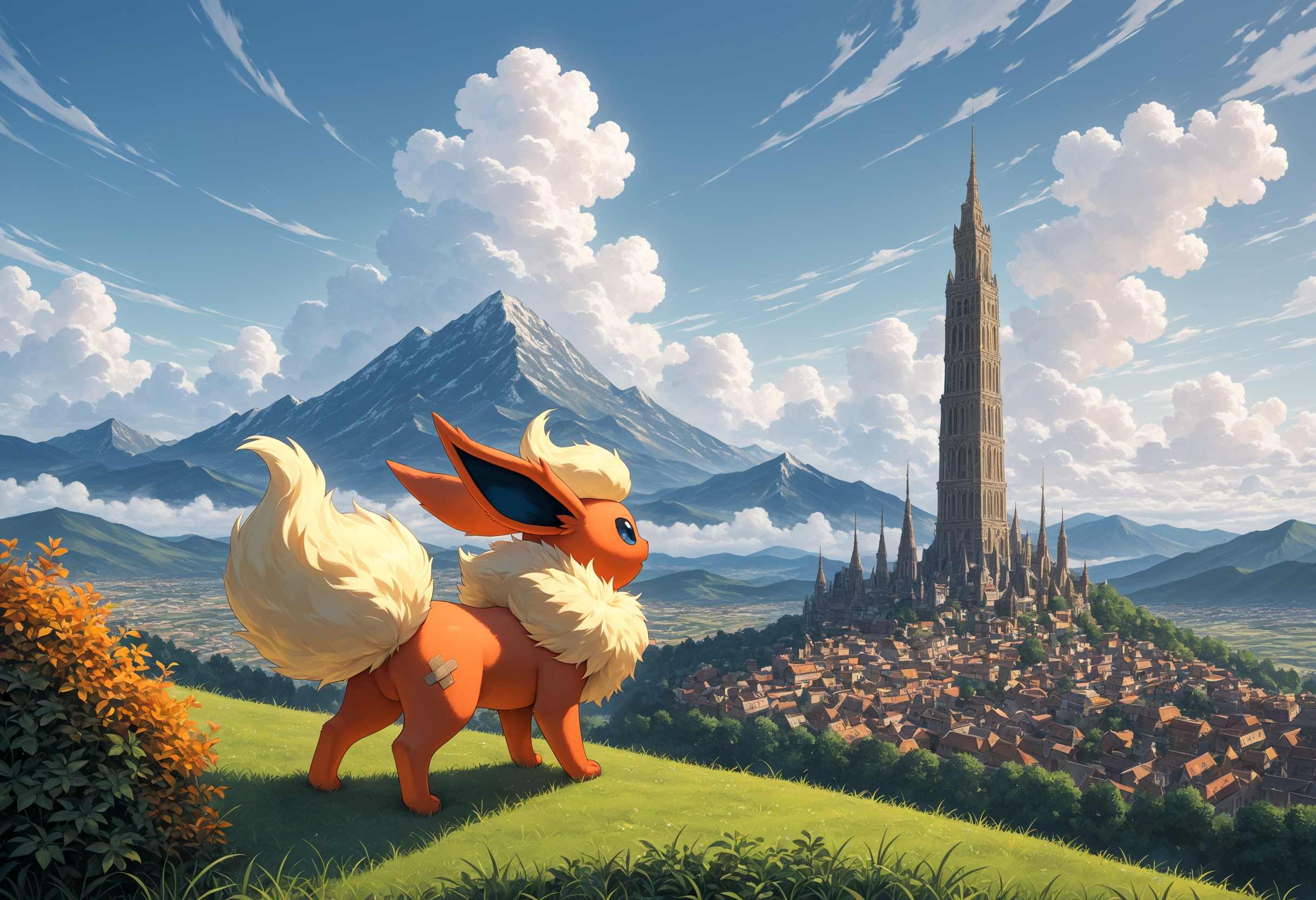
I think i have found out, that sometimes i can get even up to cfg 7 to work pretty well, but ofc not always. I would have never tried that high, if someone wouldnt have shown me pics they made with this model, using cfg 7 and i was like "That cant be right, mine get fried at even 4 already." But i guess i might have just tried another model, cause while the image i posted with it now is very bright, for me its right at the edge of burned. I have an HDR screen so its even brighter for me, but id be very interested how other people would see it? Maybe im just HDR damaged and bright is too normal for me now. c':
Oh and higher cfg do keep a 2d style better, also "simplistic, minimalist, 2d," seem to really help with that too.
try using cfg rescale before your ksampler node. it will mellow the frying out a bit
@zekses I should have mentioned, i do use that. That and FreeU together, since FreeU (with the right settings) does improve images for me, but fries them consistently without also using cfg rescale. However i did try with both off, and the color and brightness actually stayed pretty much the same, i could use just rescale ofc, but again i actually like how these turned out right now. Do the 3 Slither Wing (pokemon) images ive made with 7 cfg look straight up fried for others? Are my eyes just too damaged? D:
@Bigboyblaziken The 3 pokemon pics look right at the eghe of being too bright but probably still acceptable
Details
Files
Available On (2 platforms)
Same model published on other platforms. May have additional downloads or version variants.