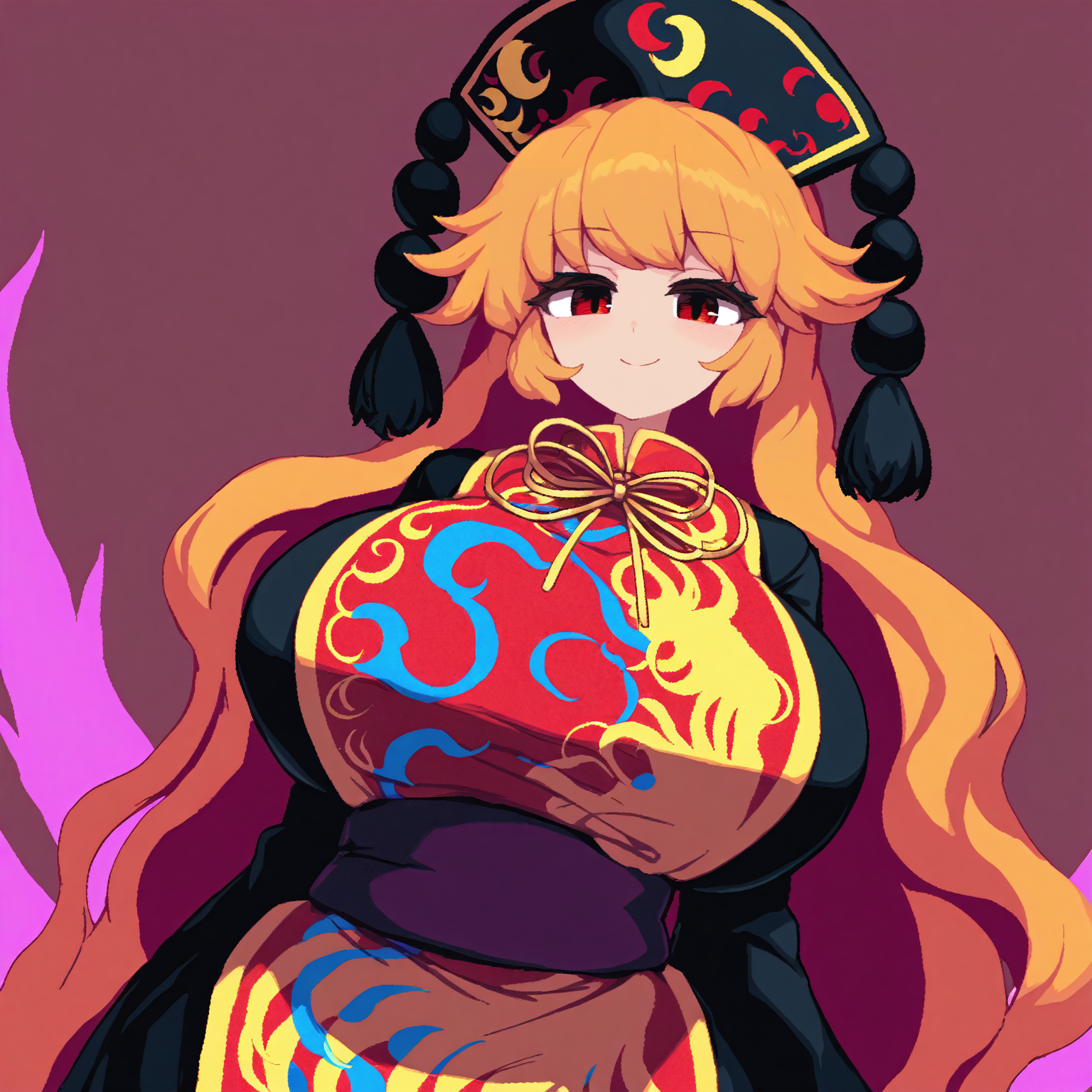
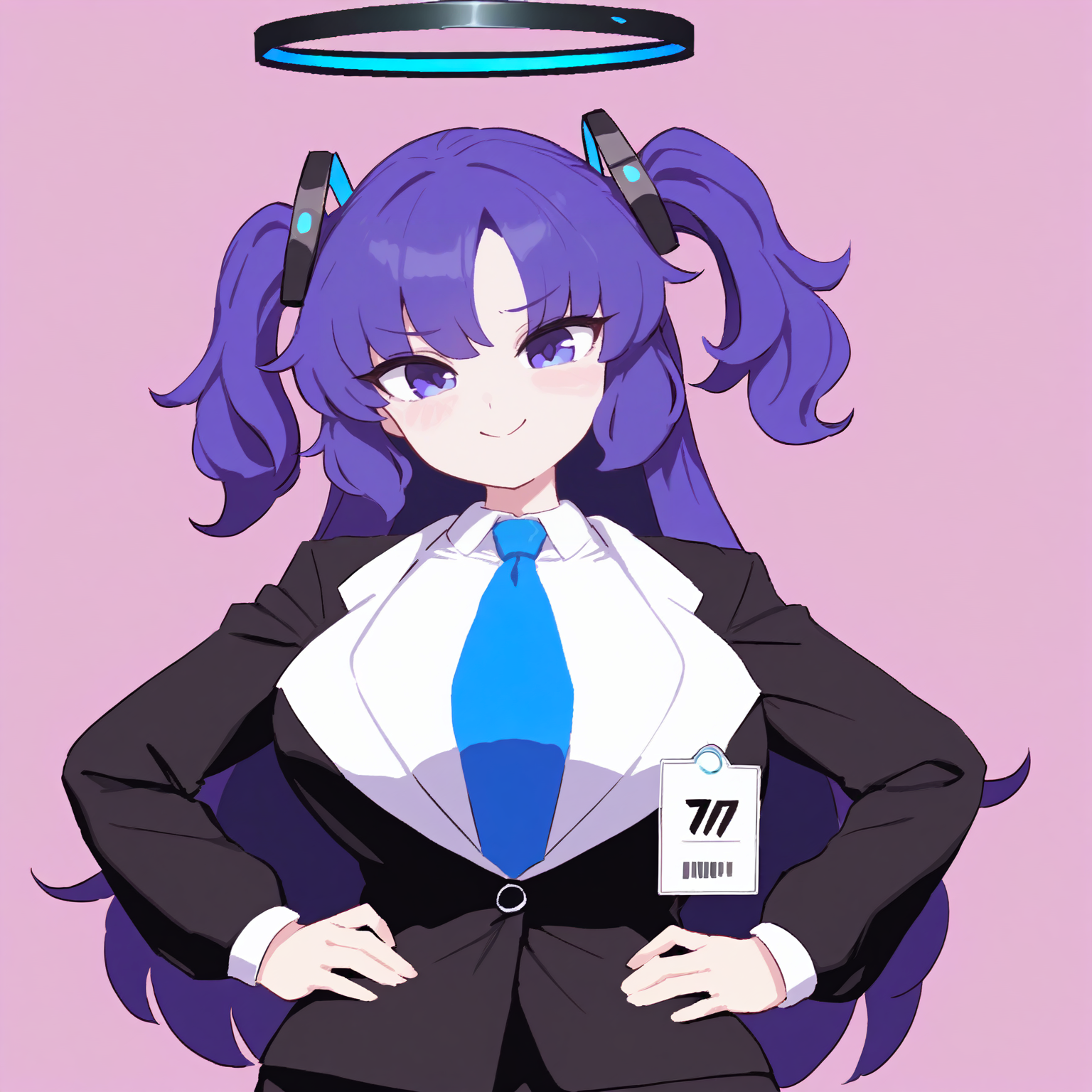
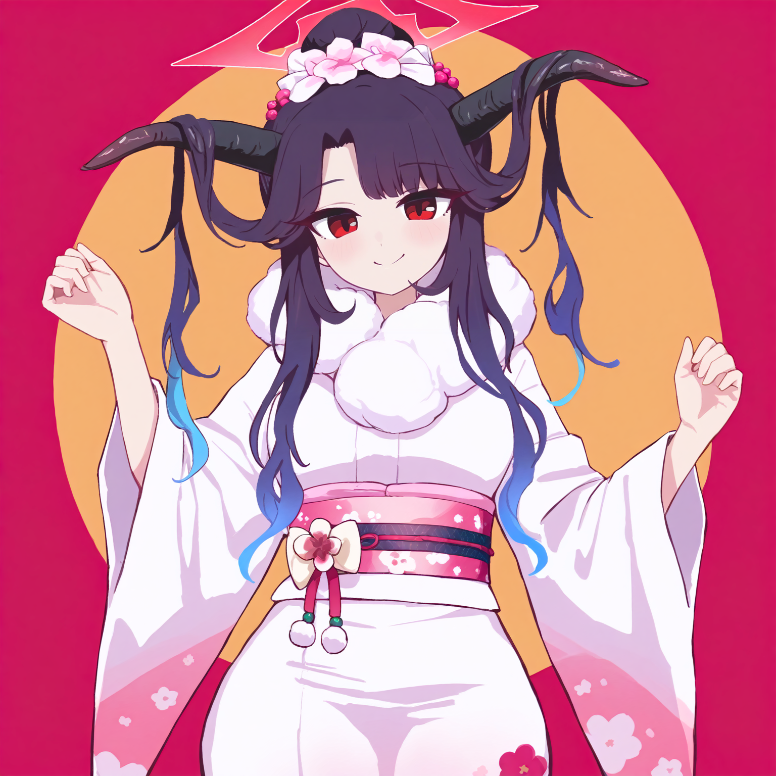
Takorin ( AKA namako8982 or namako or namako daibakuhatsu ) Artist Style
Trained with Illustrious 0.1, Compatible with Noob AI, WAI, Hesperides.
(On v1.8 - Trained with Illustrious 1.0 (TEST))
No trigger word needed
Adding 'pixelated, pixel art, dithering, jaggy lines' on negative prompt will make lines better (smooth)
and it is recommended using hires
=============================================
Anima Version is trained on Anima Base 1.0
Note that Anima v0.1 is still unstable
You may need to adjust lora strength over 1.0
I need to research about anima training
=============================================
Description
Optimized Dataset
Changed model to Illustrious XL (it was SPO on v1)
Amogus
FAQ
Comments (9)
Well I guess this is the best one. Bro big thanks for creating and uploading the model
Works well with WAI NSFW and not necessary to add "jaggy lines, pixel art" to NG words. Just need to add quality boosting prompts and NGing low quality stuff. DDIM/Euler a suggested.
this gives images that doesn't make me vomit from the uncanny valley, 10/10 <3
edit 1:
- lower CFG values work best for this model.
FOR REAL!! lmfao. I Always throw up in my mouth when i see hyper realistic stuff oh my god.
After using this lora for a pretty long period of time (ever since i've swapped to illustrious), i think it's time i said something about it
It's a very versatile style that adds nice shading, adjusts some stuff like proportions well and makes good overall results. But as with anything, it has its share of throwbacks
For example:
- on higher values, if you don't specify the angle and composition, it tends to generate full bodied characters with chibi like proportions
- again, on higher values (and sometimes middle values) it seems to struggle with generating some colors properly, leaning more into darker/purple'ish/pink'ish hues (my Tenshi pic, for example, had white shirt prompted, but with the strength of 0.65 the takorin style still gened pinkish shirt)
- idk if it's just me, but it seems like it also struggles with generating some angles and poses that the vanilla style or mix of built in artstyles could do. i've ran multiple generations with and without, more often than not it struggled with some specific scenarios. from what i can tell, it mostly struggles with face close-ups (it doesn't zoom in close enough for my liking. though if you don't mind that then the result is still decent nonetheless)
i really like this lora and use it often, it blends well with the mixes i do and looks great on it's own
Its Peak. Combine it with other resources to achieve peak'er.
It allows AI to actually look like something nice? and not just the usual AI slop that people churn out.
Seriously, why do people like that weird semi realistic style??
facts (i have not used this model yet but I can confirm that this model is so peak)
so true. the semi-realistic rubbish people churn out genuinely is disgusting to look at. no offense but DAMN.. i guess the style you use is what makes a decent looking image.
I do that but it's because it's closer to my artstyle when I used to actually draw using a drawing tablet and Clip Studio, but I'm definitely slowly leaning towards the more anime flat shading now.
you're the best!
Details
Files
Available On (2 platforms)
Same model published on other platforms. May have additional downloads or version variants.