V2.0 specific notes:
See "About This Version" for more details, but I'll note here V2 is NOT a continuation of or in any way related to V1, rather I retrained everything from scratch against base Illustrious to make V2.
V2 is also happier with a broader CFG range than V1, anything from 4.5 up to about 7.0 can give good results depending on the particular prompt and what exactly you're going for.
Lastly, here is an unordered list of tags (apart from screencap, which as I said it would be is now an independent-from-quality-tags additional control for the default style) that can be useful in any combination for generalist "style tweaking", in the positive or negative prompt:
realistic, photorealistic, photo \(medium\), 3d, cgi, 2d, traditional media
All other advice WRT prompting is the same as for V1, as in the general notes below, including all the info about balancing artists tags if using them with quality tags.
General Notes:
This is Illustrious XL 0.1 "Raw" with the following changes:
further trained on an additional dataset of 2000+ hand-selected and well-captioned images for roughly 80 epochs or so, as of V1
DPO Lora injected @ 0.25 strength
SPO Lora injected @ 0.75 strength
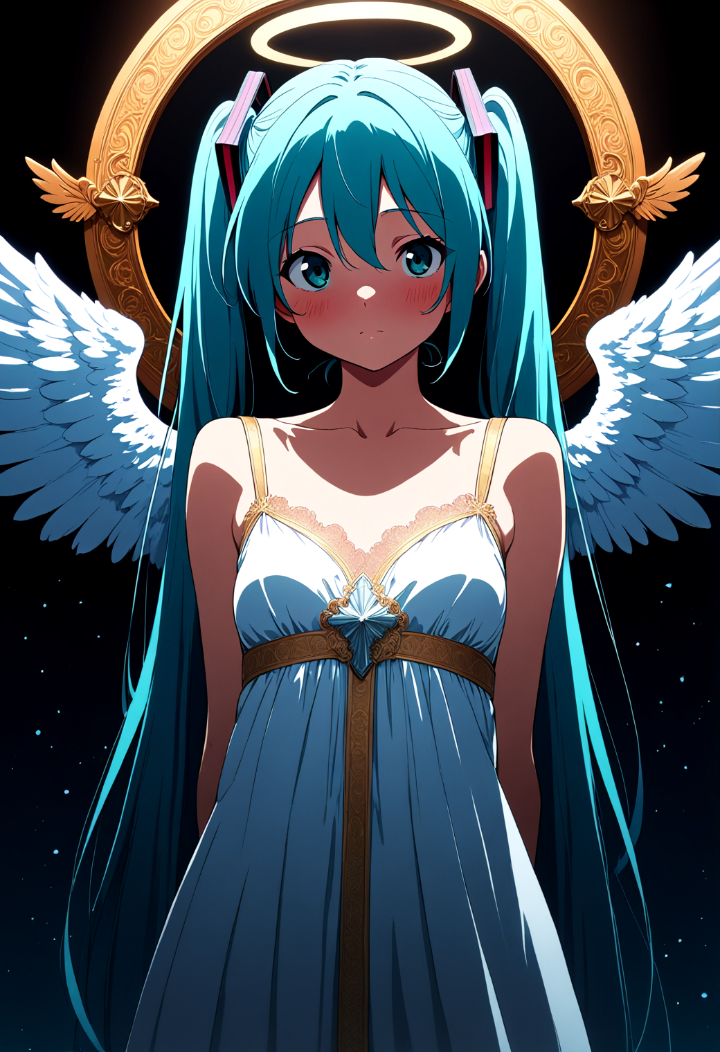
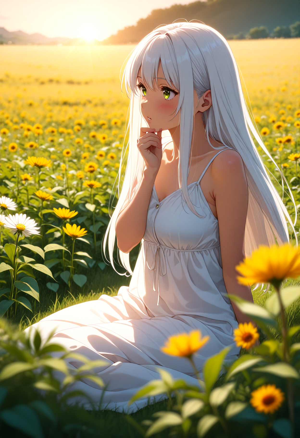
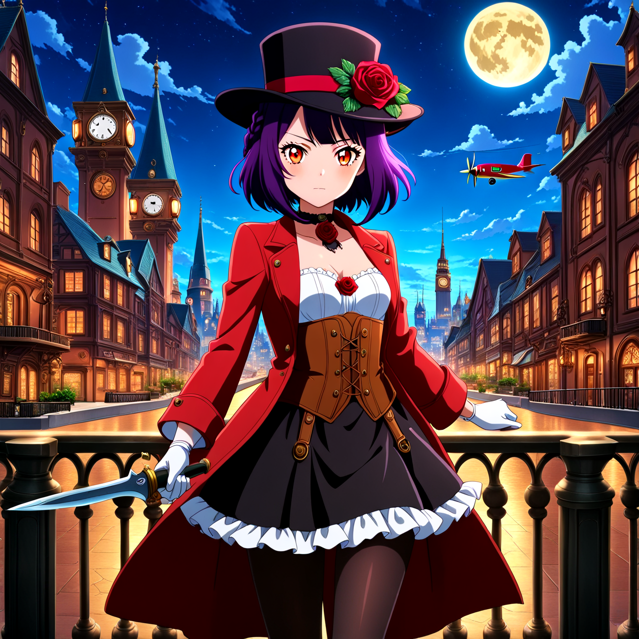
This checkpoint aims to make the default output style of the model more consistently clean and coherent based on standard anime model quality tags (e.g. masterpiece, best quality, high quality, absurdres and so on), without actively degrading or "erasing" any of the base knowledge of Illustrious.
Lower CFG tends to give better results, I recommend anywhere from 4.0 to 5.0ish with Euler Ancestral Normal or sometimes Euler Ancestral Karras.
If you're choosing to use named artist tags such as e.g. hungry clicker or cutesexyrobutts in your positive prompt, using negative quality tags along with them in the negative prompt (such as e.g. worst quality, low quality, normal quality, lowres) is generally still beneficial and tends to improve the accuracy of any given named style, however you don't necessarily always need (or want) to still use positive quality tags at the same time as named artist ones.
Do not use the DPO or SPO loras again on top of this checkpoint, they are both already injected at carefully chosen strengths, running them again on top will almost certainly make your outputs worse.
For "hi-res-fix" upscaling with this checkpoint, I personally recommend using either 4x Foolhardy Remacri or 4x FaceUp DAT as the upscale model.
Description
Initial version. VAE is baked in.
FAQ
Comments (10)
I was going to ignore this model at first, but then some of the example images caught my attention. They had backgrounds. Illustrious backgrounds are.........well, not good. So I decided to test this model really quick. Ohhhh boy. This is one of the most impressive XL models I've ever used. I haven't fully tested it but it has won me over from Smooth. Just the fact it can do backgrounds and still be illustrious under the hood makes it perfect for me. Good job, diffusionfanatic. I don't know how you managed to get illustrious to do backgrounds but I am so glad you did. Now it's perfect. (for me) Here is a link to my test images. I will be posting more test when I get the time.
Thanks for the feedback, I really appreciate it! Glad you like it. Your images are fantastic BTW, making better use of the model than even I did in the actual sample images in some of them, haha.
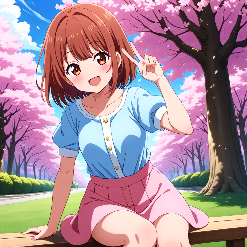
After testing this model for a while, I have a few additional thoughts I'd like to add. The default colors on this model are noticeably saturated. I don't mind it as I feel it works well with the default 2D style, but there's been a hand full of images that came out with an impression of "over cooked". The good news is, this is easily fixable by simply adding "colorful" to the negative.
The hand full of artist/style tags I tested worked but they were influenced by the default style. I noticed if I place the tag high in the list while increasing the weight, I managed to gain the desired results. (For example:granblue fantasy gen) I know some people expect a perfect replication with artist/style tags and there's nothing wrong with using the right model for the job. I'm personally not very picky since I adore the default style and backgrounds, plus loras seem to work well enough.
I'll keep using this version and testing illustrious as a whole. Thanks again, mate.
@Fish788 Thanks for the feedback! Yeah, I mentioned to another commenter I have some ideas for captioning that should make it more possible to individually "negate" the default style without disassociating it from the quality tags, while still allowing you to use the quality tags, in a future version possibly (I'll likely re-do this thing when the base model itself gets a significant update, basically).
As far as the colors also I think I know what you mean in general, it's definitely something I'll keep in mind for tweaking a bit too.
To reiterate what I said up in the description, keep in mind that while negative quality tags are generally always at least somewhat beneficial, you don't necessarily always need to (and sometimes shouldn't) use both positive quality tags and named artist tags at the same time. It may give you more "expected" results to either only use artist names or only use quality tags, as far as the positive prompt stuff goes.
So don't take this as a criticism-criticism, just something very specific I noticed about this particular tune of Illustrious. Compared to others, it appears to be completely insensitive to some "generic" style tags, especially in the traditional media group. Stuff like colored pencil \(medium\), graphite \(medium\) - they're ignored in favour of the "default" style of the model. Is there a reason for that or, out of curiosity, was it a conscious decision in the tuning process?
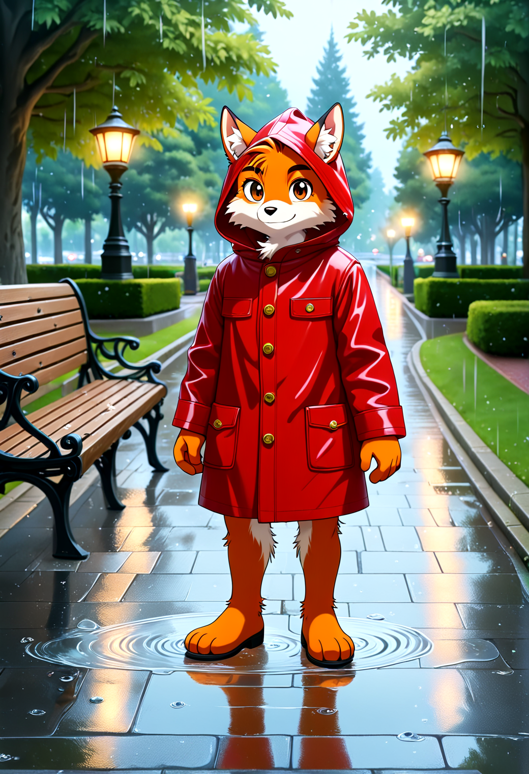
Myself, I appreciate the model having its own, semi-stable "default" style and, as another commenter mentioned, the much better handling of backgrounds. I'll have to spend more time with it to truly feel out its MO, but the above jumped out at me almost immediately.
@reavski There is at least one gen I did that should be down in the gallery (not the main one but the one below where user pics go too) that was a full on black-and-white graphite-on-paper thing, complete with like a burnt edge effect, that might help you to achieve that sort of thing if you check the prompt.
I didn't consciously try to tune anything out in general though no, but some artist tags that were already particularly weak / unstable in the base model might be trickier to use in this one.
I do have some ideas on how to better make the default style still be associated with positive quality tags but also specifically "negatable" on its own independent of them in future versions though, so keep an eye out for that.
@diffusionfanatic1173 That IS of much interest to me, although I don't doubt I'm the one-in-a-thousand user who DOESN'T want to use or depend on artist tags. Let's not kid ourselves; that's NAIv3's main selling point for a reason.
Went ahead and tried generic style tags at a greater strength, and I can confirm that, yes, it does work for Zoot... well, most of the time. Guess I got used to not having to do that since the SD1.5 days. They also, surprise-surprise, have an easier time triggering with artists who already do works in the given medium. In any event, this is still a marked difference from base Illustrious, where those generic style tags would greatly change the results even at the default :1 strength, with no artist prompted. Not saying this is something you should or even want to focus on, just pointing it out in case you do want to. Again, I'm personally grateful that somebody went and tuned a checkpoint with its own, distinct style. Appreciate that a bunch. Making it discrete and "promptable" would be a neat QOL addition, with that I do agree.
All in all, you've put in some great work here, so I hope my nitpicking doesn't dampen your spirits. I'll continue using this tune even if you give the fig to my whinging. It just works so much better for my purposes than base Illustrious. Cheers!
@reavski Not at all, I appreciate the feedback!
V2 plans:
- make the default screencap style of the model have a shared association across the dataset not only with quality tags but also a unique screencap tag (chosen because it is not an existing Booru tag) that can be dialed back independently in the negative prompt if desired
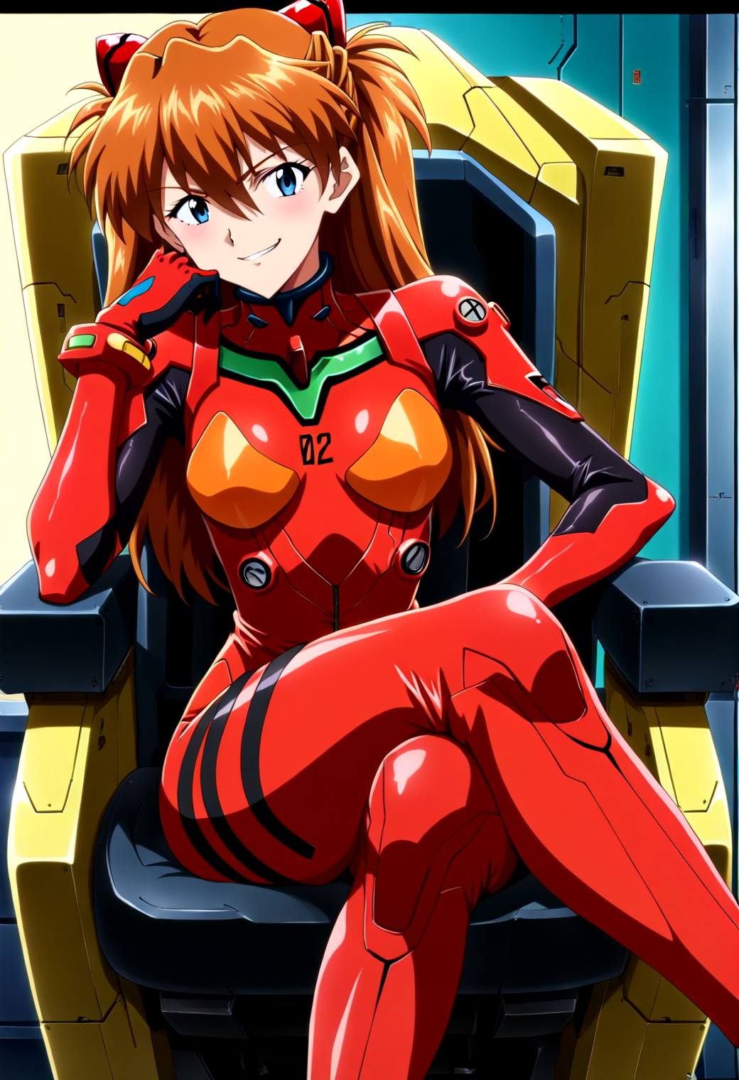
- address the "runaway red shift" that occurs as far as the color palette for certain gens (this turned out to be related to how a certain subset of my data generally looked relative to how it was tagged)
Details
Files
Available On (1 platform)
Same model published on other platforms. May have additional downloads or version variants.