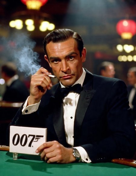
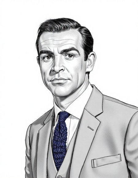
It could well be argued that Sir Sean Connery did more to define James Bond than Ian Fleming.
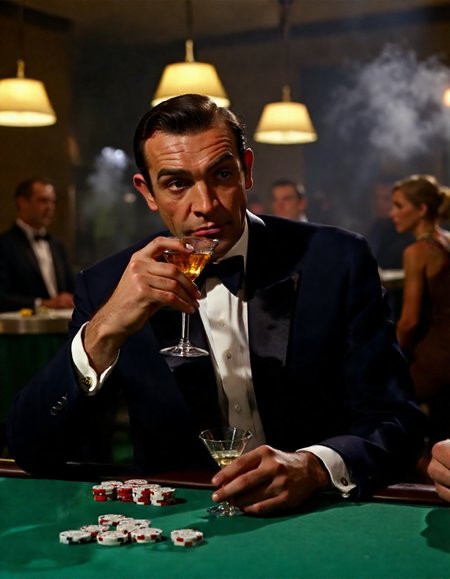
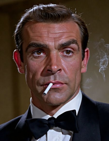
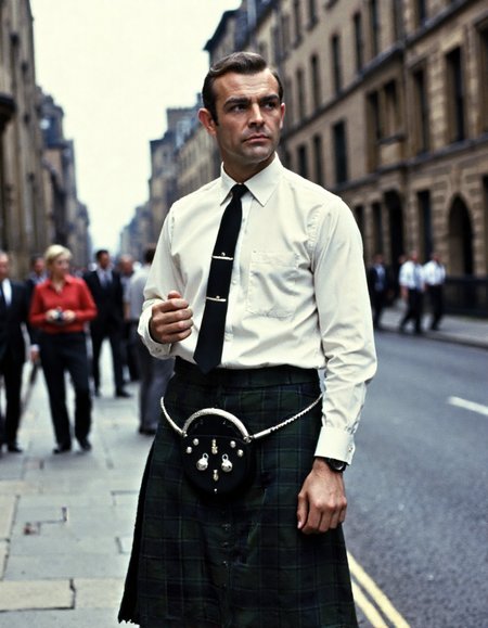
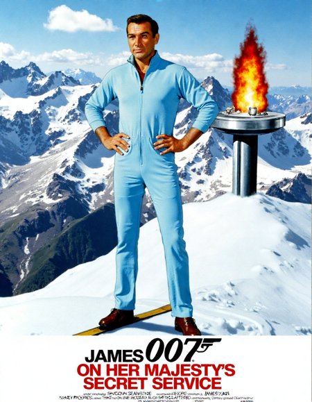
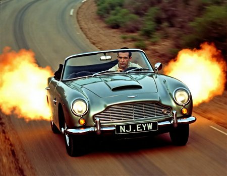
This LoRA is trained on around 65 images of Sir Sean as James Bond. I've used still photos from his first outing in 1962 right through to 1983's Never Say Never Again. Mileage seems to vary as a result - sometimes forehead wrinkles seem to be those of an older Sean circa 1983 while the film quality of a photographic output seems to be more inline with still photos of the 1960s. On set photos from that period typically aren't great.
If you do generate anything with this, I'd love to see you upload them below. Big fan of Bond, particularly artwork associated with it. It might also help me refine this LoRA for a version 2 if I can better understand how it performs for others.
Description
A first pass at a Sir Sean Connery as James Bond Flux LoRA.
Razor sharp training images from the 60s are hard to come by which may explain the softness of some of the output - typical of behind the scenes photos from the Bond sets of the day. I'll look at revising the training data for a future sets.
FAQ
Comments (9)
is this any different from the last version you made and posted?
I accidentally uploaded another LoRA also starting with S (my Stanley Borack one). Just replaced it with the proper SeanConn.safetensors
New version's safetensor now verified @EnragedAntelope - thanks for checking
Good job! Try upscaling the dataset images in comfyui (or whatever) with CCSR by 5x (to maintain accuracy), the SUPIR (to sharpen fine details) by 1.5x. then shrink and crop them to retrain. See Reddit user u/mocmocmoc81
post about it in the r/StableDiffusions subreddit.
Thanks for the tip - I hadn't seen that technique. I'll pursue that and give this a solid retrain.
Thanks for the tips @afterate2 - I retrained the model based on the Reddit post. Definitely results in a sharper output
@countlippe I am glad it worked for you :)
Actually, comparing V2 to V1, it does look sharper and in some cases his brown eyes really shine, but V1's overall lighting and contrast looks more realistic, as if it's a screen cap of a movie. V2 looks artificial... more AI like. Although somethings were gained, something else was lost going from V1 to V2.
@afterate2 Thanks for testing it and for the buzz - I feel the same. There's sharpness in version 2, but it's also picked up on the authentic nature of the upscaling. I'll be trying to find some alternative upscaling methods for a v3 I think.