
Updates for the SD 3.5 LoRA
I added the DaV1nc1 trigger word (for SD3.5 Large) after training without it. I think it works better. I edited the captions significantly for SD35 and tried different approaches. Most of my sample images have the prompt embedded if you use ComfyUI you can see it.
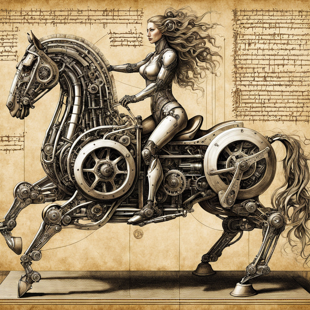
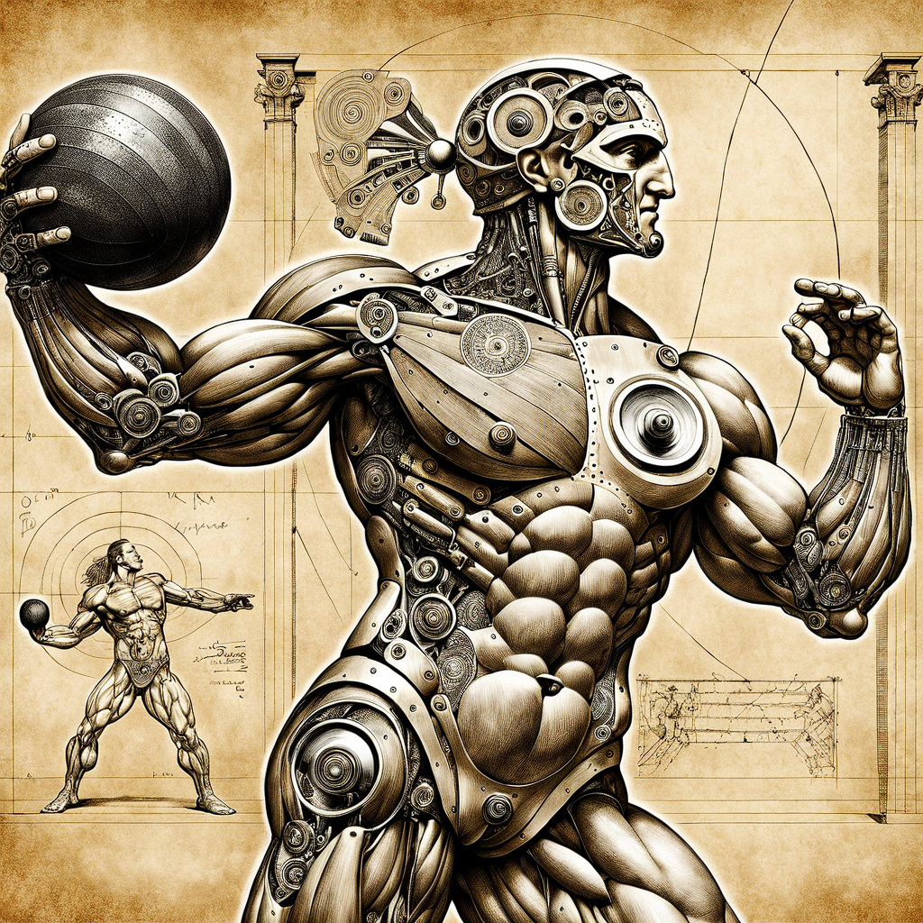
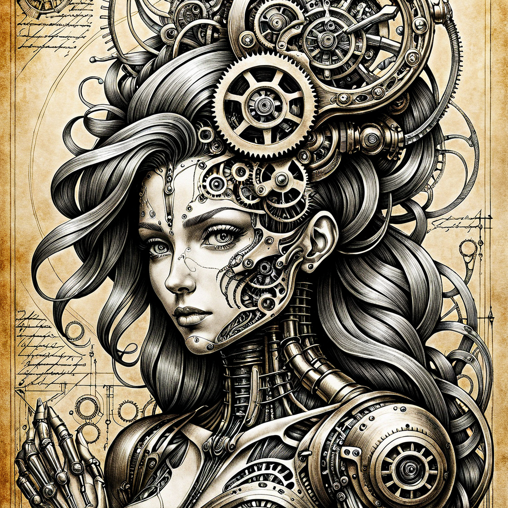
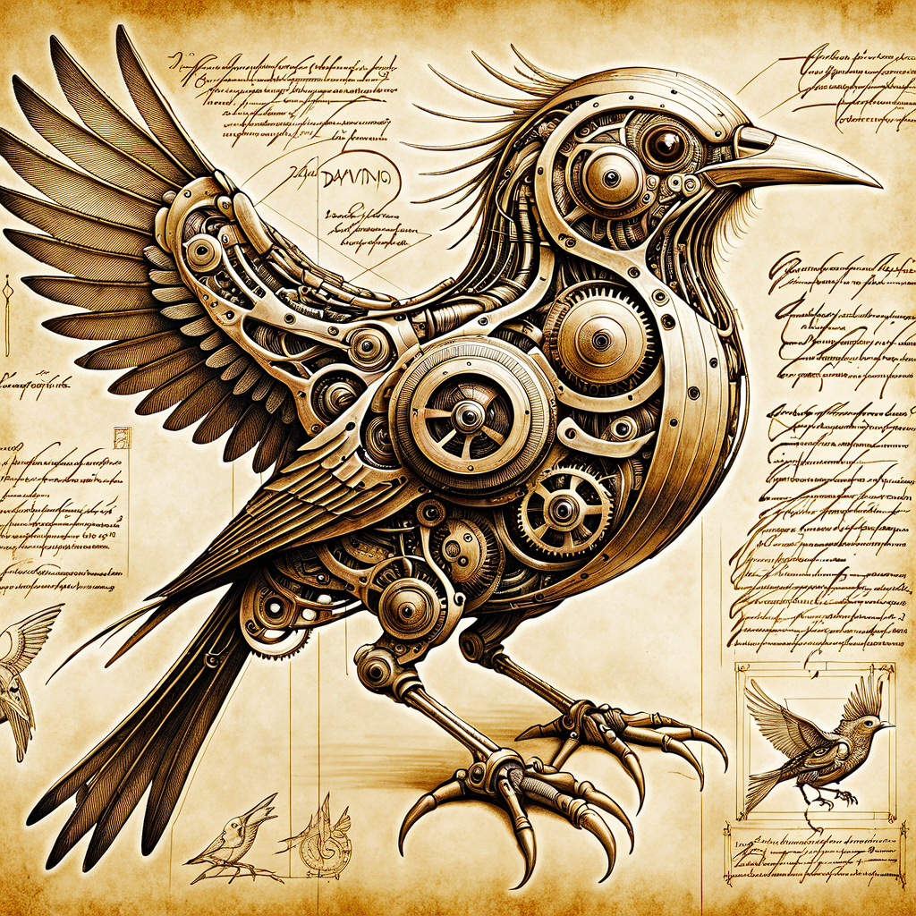
You can also see the range and variety of images it can produce in the samples.
The model should also respond to the following words:
Biomech
Anatomical Study
Medical Study
Vitruvian
Annotation
Sepia
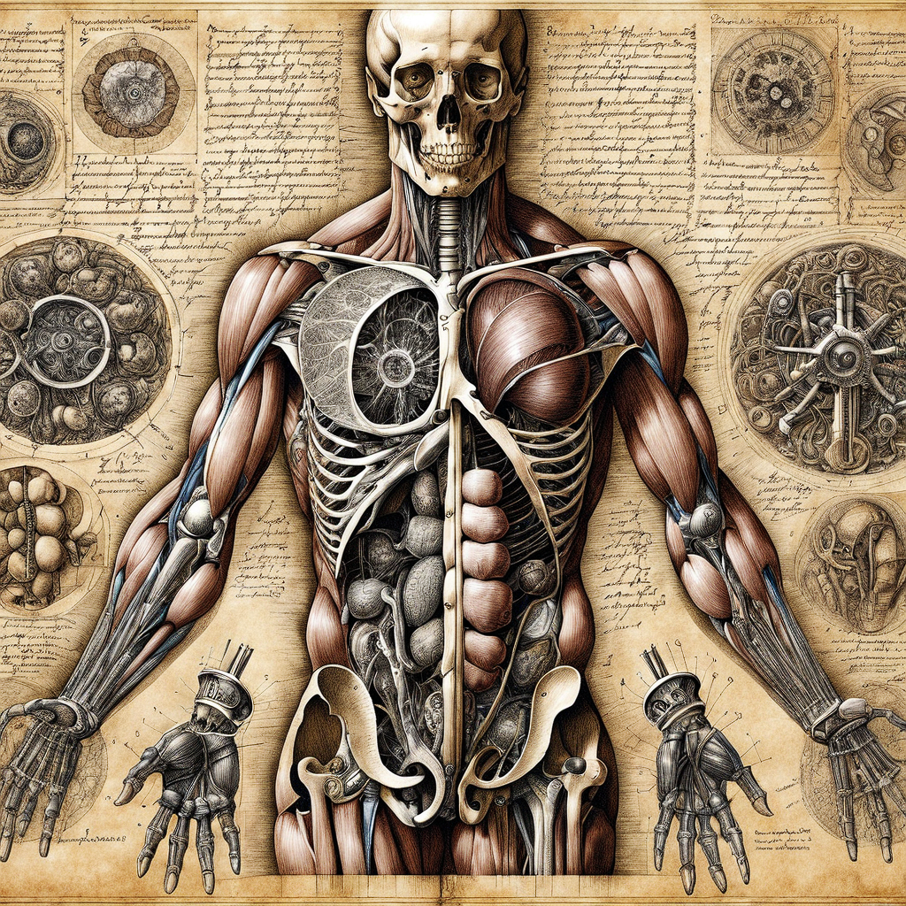
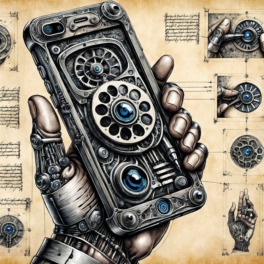
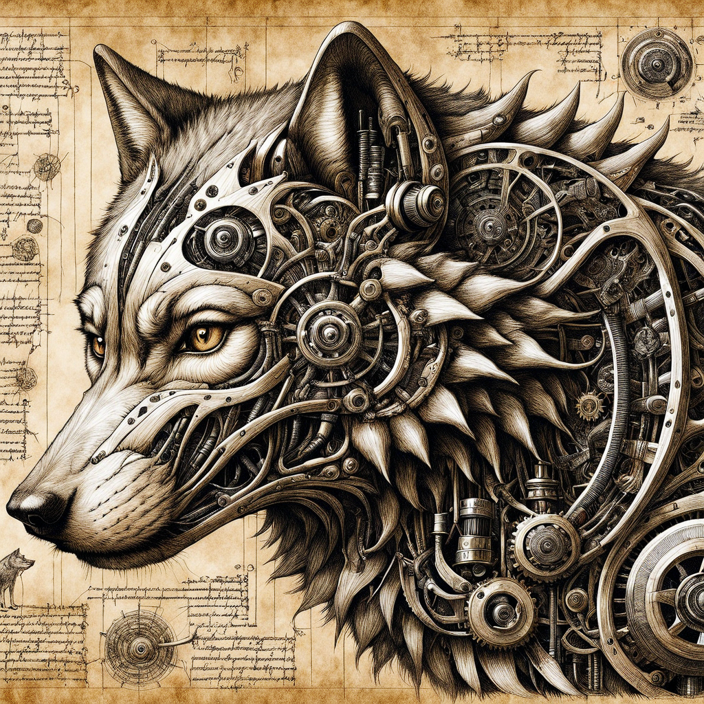
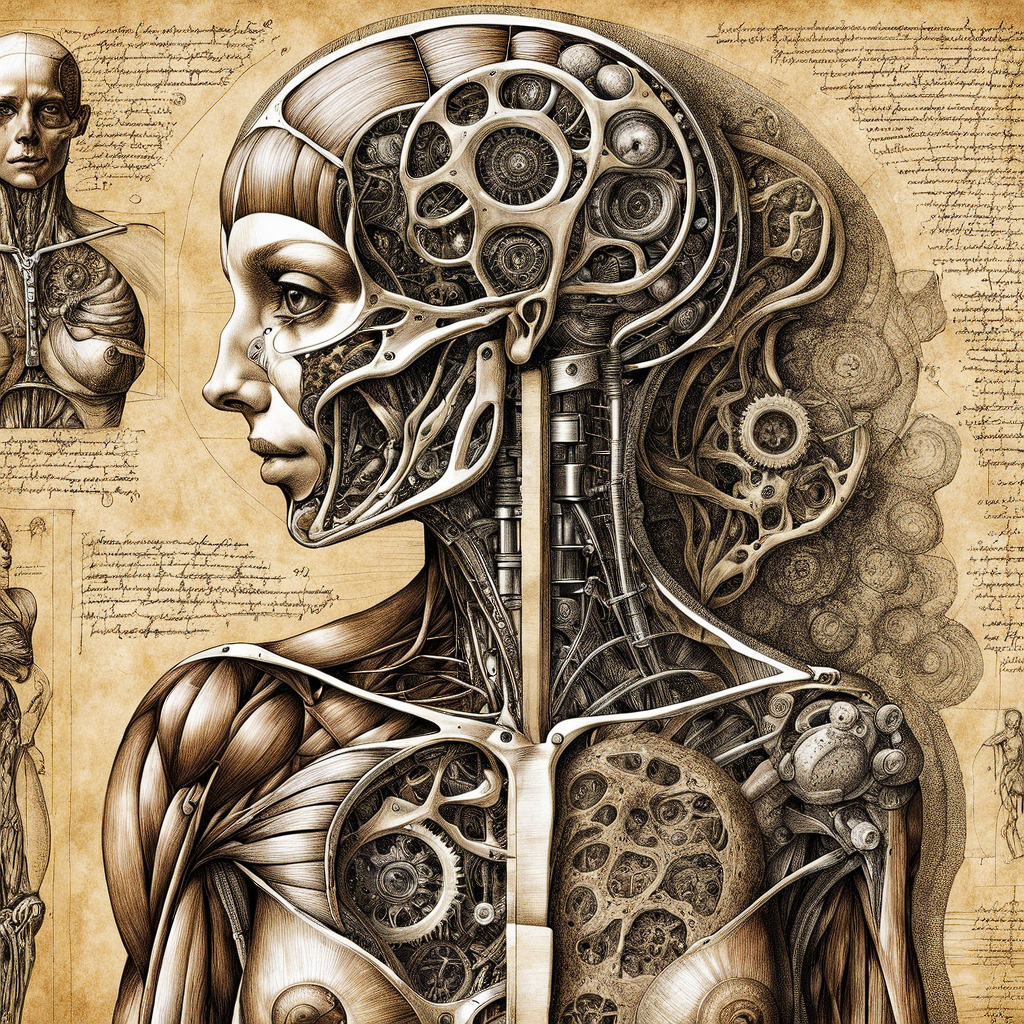
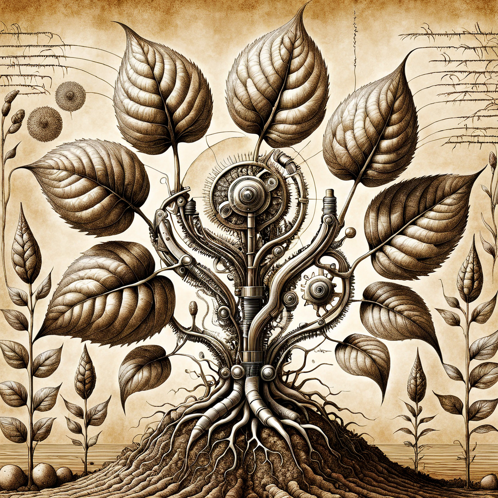
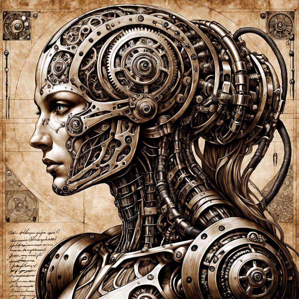
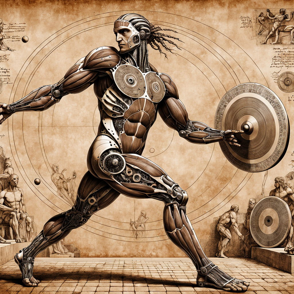
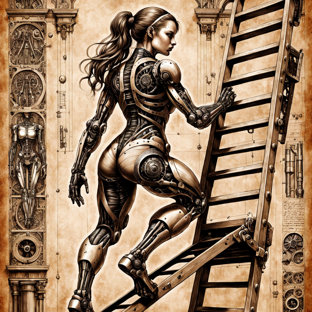
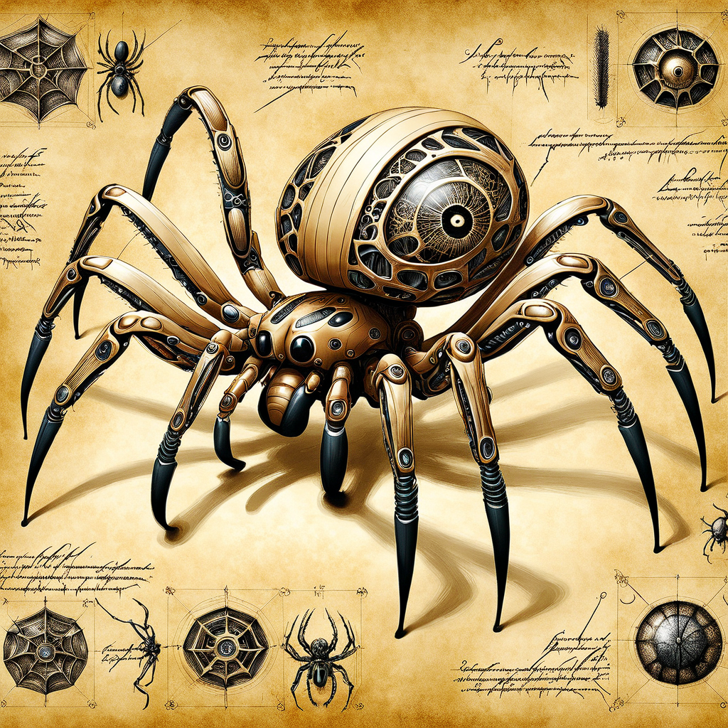
This model creates biomechanical people and animals in the style of Leonardo Da Vinci's pen and ink studies. Seems to work well in the range of about 0.6 strength, but experiment as it gets stronger and has different effects all the way from 0.1 to 1.5
Try a simple prompt like "biomech _______ _______ , ink by Da_Vinci, sepia"
Keywords to experiment with:
anatomical or medical study - will show a partly cut-away drawing with more human elements and maybe with break-out drawings of internal bits
biomech, steampunk - will give you more gears and mechanical parts
cyborg - more robot than living
ink or ink drawing - can be important if you are not getting the ink drawing style
sepia - to make it look older and more like a Renaissance-style drawing
vitruvian - Should give you the famous arms and legs extended drawing style with double arms
The prompts don't come through since I used ComfyUI, but you can load them in Comfy and see the prompts. They are extremely simple, like "Biomech girl riding a horse, by Da_Vinci, ink, sepia, 8k, masterpiece, extremely detailed." If you read this far, fantastic congrats - hope you enjoy it.
Keep in mind it's my first Lora ever, I might post more or hopefully better ones with encouragement.
It wasn't trained on NSFW images but it seems to be able to do some - but YMMV and it may depend on which ckpt you use.
This is my first Lora, made from images I generated myself based on a Renaissance-style pen and ink sketch with annotations inspired by Da Vinci's anatomical/medical studies but with a biomechanical twist. I used 55 images I generated myself based on that concept and this was trained on Civitai - Epoch 8 seemed the best choice even though Civitai suggested Epoch 15 might be the best. I just found Epoch 15 to be too strong.
Description
1st Version, 8th epoch
FAQ
Comments (4)
Love it! A very good start to a first attempt. Keep at it!
Hey, I'm loving this, but I have one issue that's frustrating me... almost every gen looks "cropped" - like you zoomed into a page. The text is cut off on both sides!
I tried adding full page view and margins to the prompt. Tried negs of crop, cropped, cut off, zoomed in, different gen sizes, etc. I tried several models and only ones that rarely do the annotations will do one or 2 words in the center, but nothing cut off.
I wanted to do a late Christmas thing for a friend with this, but weird cut off text on either side makes it unusable. How does this happen? I have no idea what you trained it with. I'm having to put some Lorem Ipsum on in handwriting fonts myself. Or take the least cropped gens and photoshop in a little margin on the left and right. It almost never runs off the top or bottom. In fact, I've seen the page texture stop early and it leave a white stripe at the top - yet still crop text on the sides. Even at 1344x832.
Sorry for being anal retentive, but I am...LOL. And just starting to train models myself. I did Escher and got rashes of strange staircase railings I can't explain...LOL.
Probably if you mix in one of the blueprint lora or schematic lora that might help you, or perhaps even just using the word(s) blueprint, chart, or poster in the prompt. Take a look at the sample images in the gallery that have what you want - they have schematic or blueprint in the prompt. You need to describe what you want in the prompt. Also you can use the negative prompt for things you don't want ie. 'cut off text' incomplete text. Just changing image size won't help at all.