

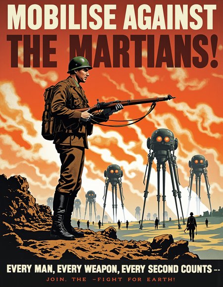

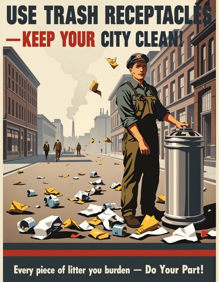
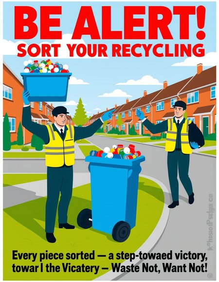

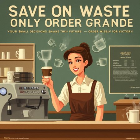
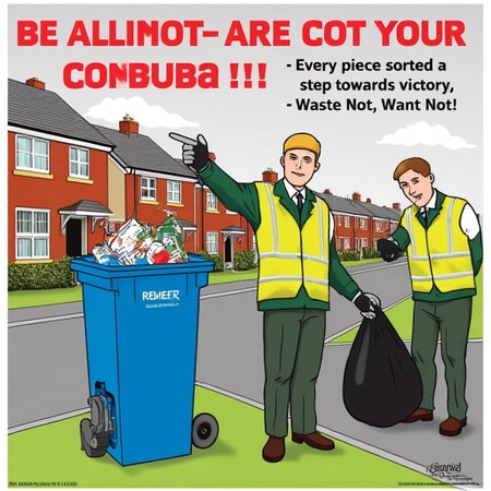
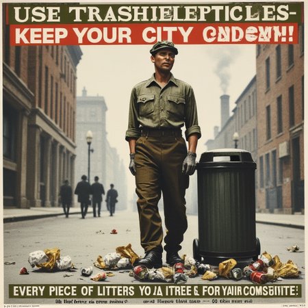
REME’s War Poster Style evokes the bold, direct, and visually striking aesthetic of mid-20th century wartime propaganda posters, with a focus on strong, central figures engaged in purposeful action. This style uses clear, high-contrast colour palettes with strong primary colours—red for urgency, blue for stability, green for industry, and muted earth tones for working environments. Characters are shown in dynamic, confident poses with expressive facial features, highlighting pride, resolve, or caution. Text is always prominent, in large, bold capital letters with blocky, utilitarian fonts that ensure readability from a distance, often accompanied by smaller supporting text. Backgrounds are simplified, with atmospheric skies, faint architectural elements, or abstract silhouettes to maintain focus on the central message. The overall composition balances clear, heroic imagery with urgent messaging, combining realism with slight stylization to emphasize clarity and impact. When invoking this style, users should focus on clear purpose-driven scenes, heroic or cautionary figures, and simple, strong compositions with a direct message, always tied to a clear call to action for the viewer.