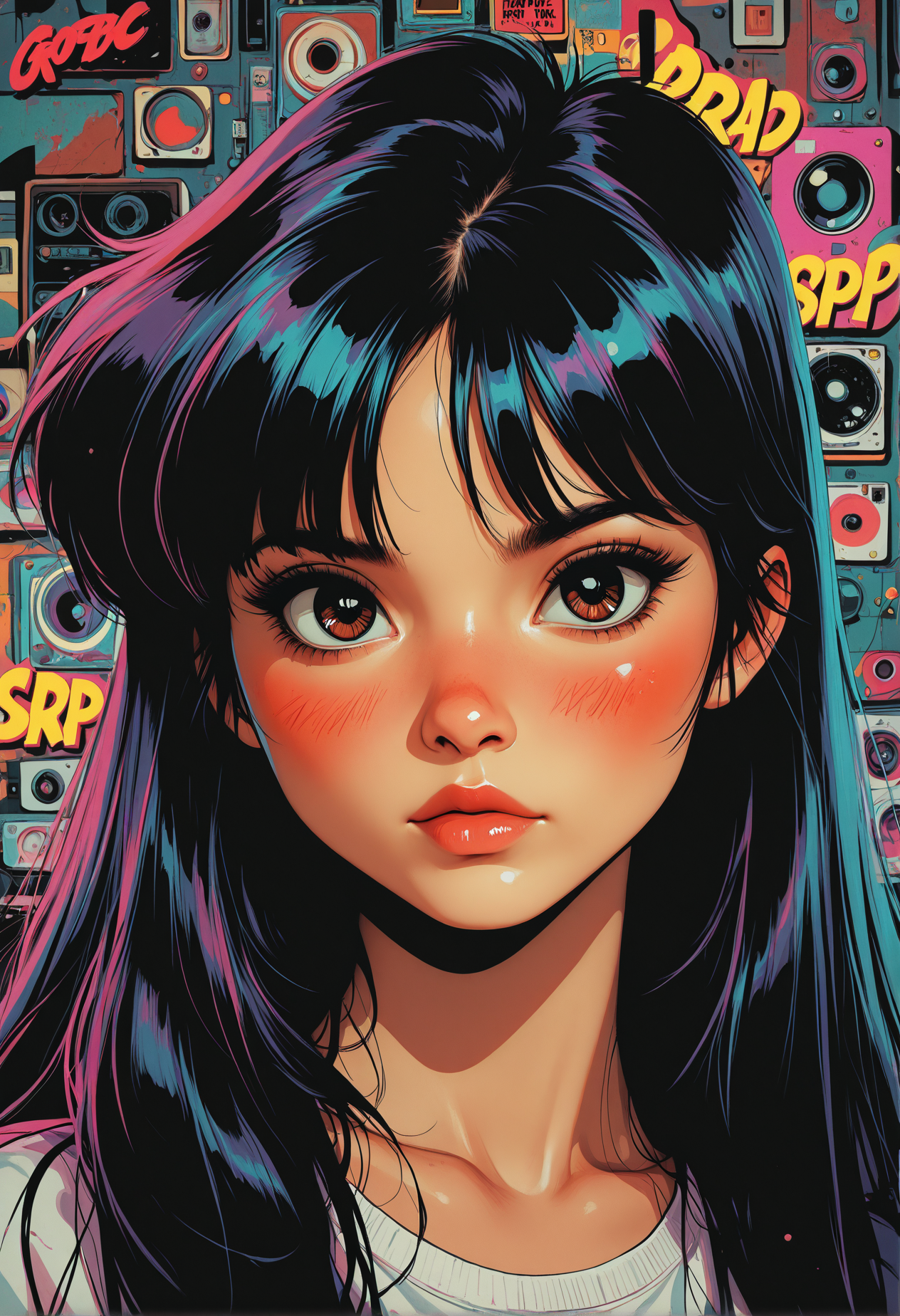
hey guys, ☺
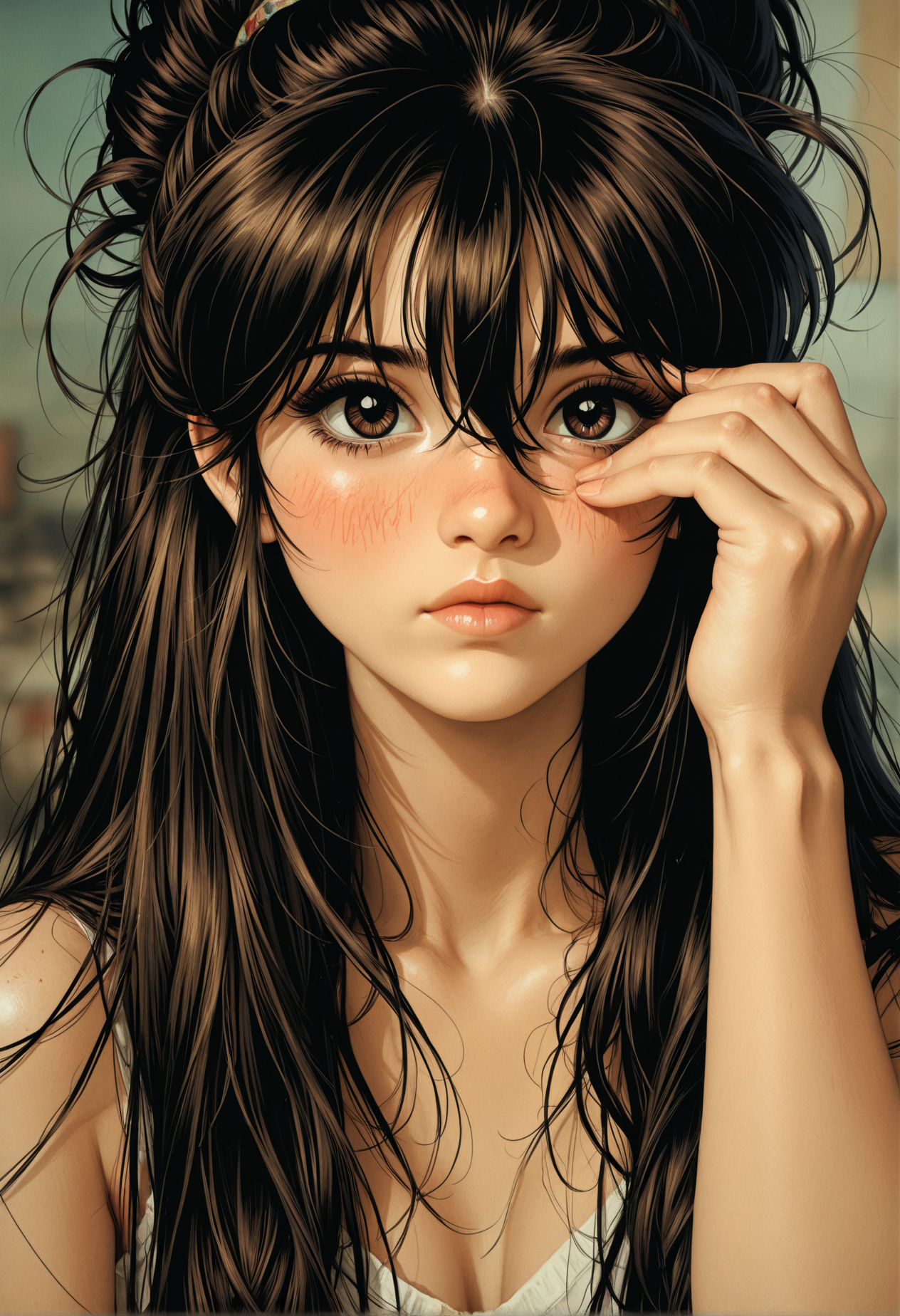
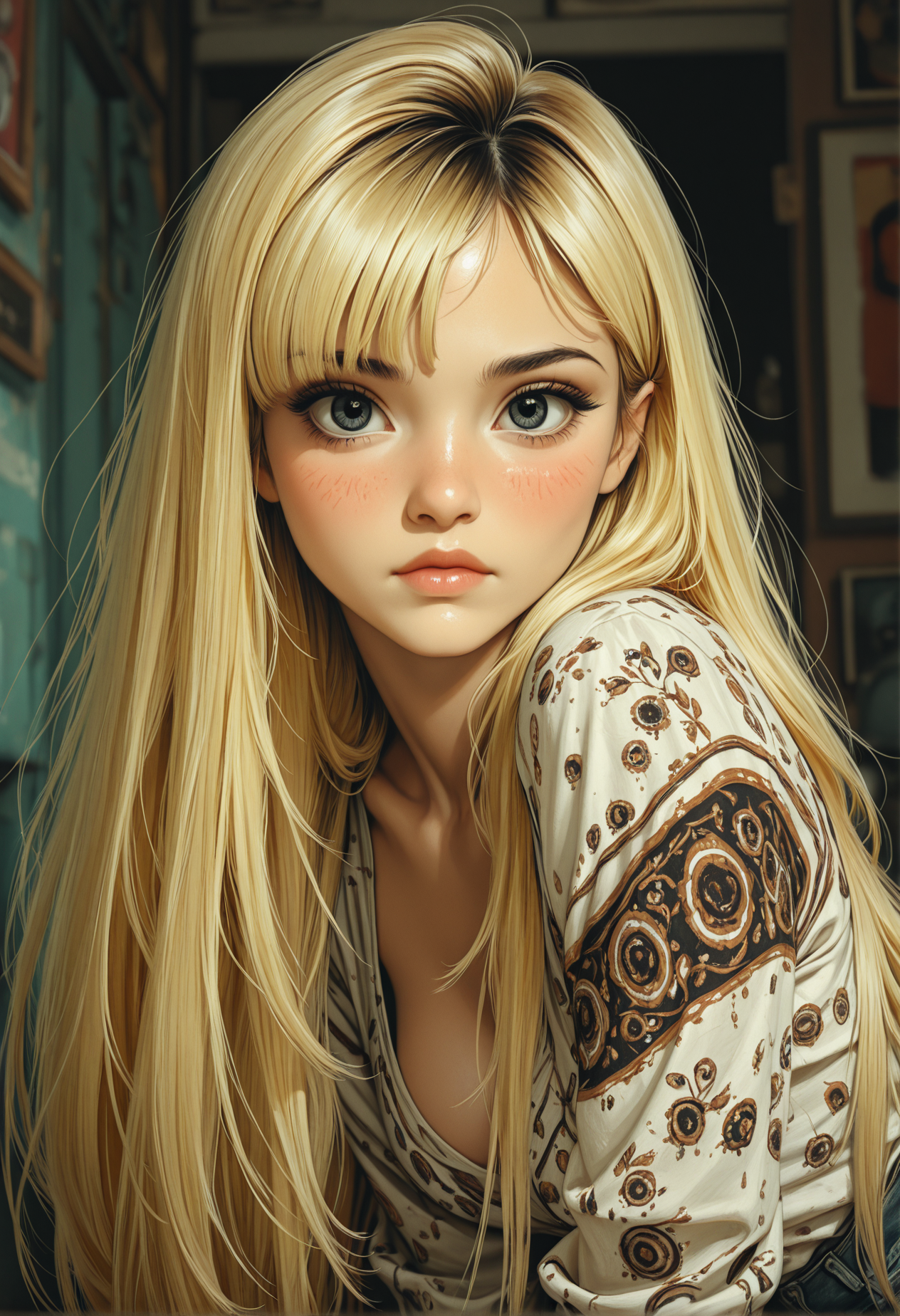
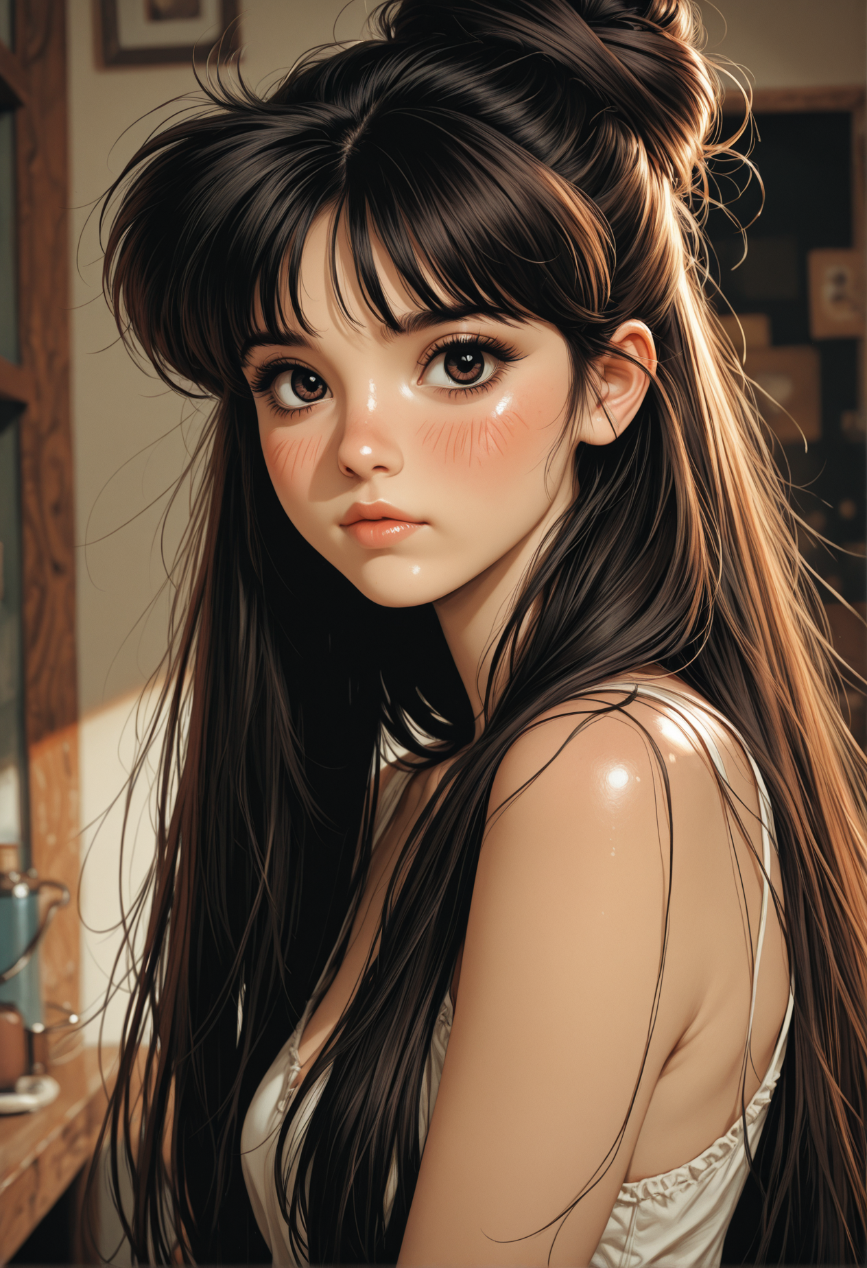
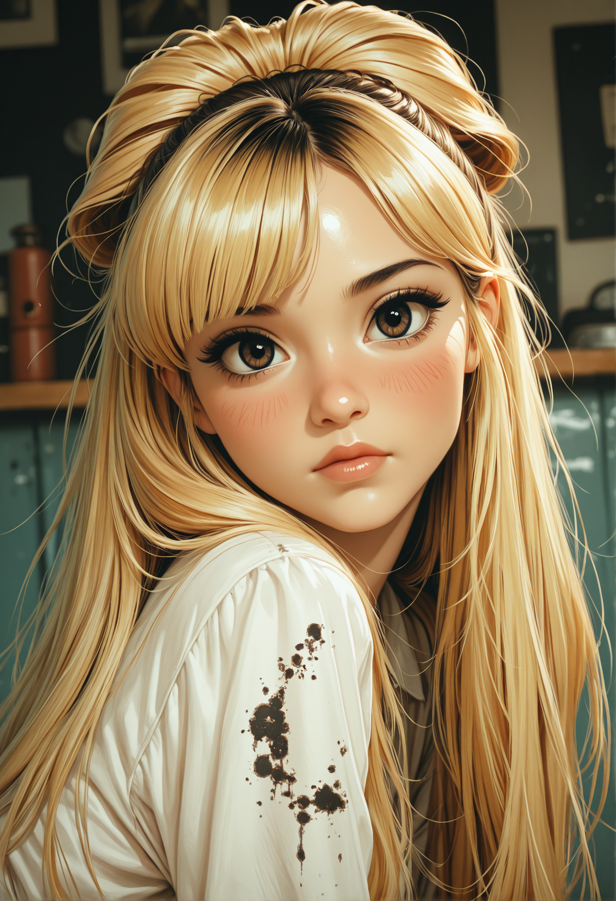
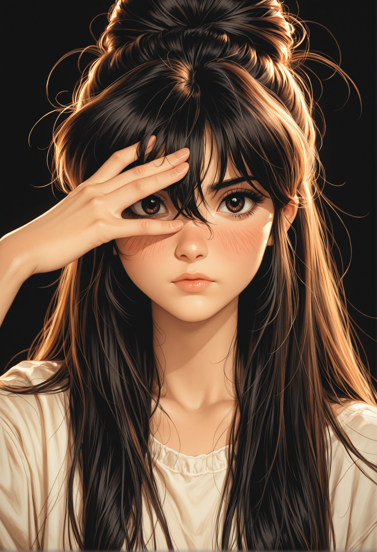
as u know I rlly love comic-anime-hybrid based checkpoints and digital art rendering with a touch of 3D on its way to semirealism. So I've thought it would be time to test Illustrious. This is how I wanna present to u ~ Illustrij ~ my first merged Illustrious checkpoint :)

NEW ♥
💌 v21
"Illustrij ~ imperfectly authentic, a real little nose dimple.
Yes, you heard right ~ there she is: a quiet presence, simply there.
Ready for adventure.
Illustrij, a moment of possibility ~
ready for encounter."
Want to meet v21?
She’ll introduce herself:
♥ https://civarchive.com/articles/26631
🎶 about v20
Hey friends,
I’m happy to introduce v20 ☺
Your feedback really counts ~ and you can feel it here.
v20 leans more toward v18 in look, attitude, and overall style: very Illustrij, just a little more grown up ^^
This new version also includes one of my private LoRAs, based on my artificial handwriting.
I hope you enjoy exploring with Illustrij as much as I do ✨
with ♥ Reij
💎 | Setting (option examples):
Euler a • steps 30 • CFG 7
💎 | Hires Setting (option examples):
832x1216 💎 Hires x 1,5 • Denoising strength 0,4 • Hires steps 10 • Hires CFG Scale 4
832x1536 💎 Hires x 1,5 • Denoising strength 0,2 • Hires steps 10 • Hires CFG Scale 2
💎| Quality Tags (option examples):
| + | masterpiece, best quality,
| + | masterpiece, best quality, ultra-detailed, 8k resolution, high dynamic range, absurdres, stunningly, intricate details, sharp focus, detailed eyes, cinematic color grading, high-resolution texture
| ~ | worst quality, bad quality,
🎶 about v19
sooo… Illustrij update? I’d say she’s matured^^
“grown”? more like years instead of months :P
~Illustrij spawns: more NSFW focus, more adult vibe ~ that’s important to me.
perfection? I say: creativity!
Illustrij ~ a mirror of my own excursions, adventures, and discoveries in the AI world^^
of course with lots of love and curiosity ♥
artistic, sensual eroticism… a part of me.
spark-seeker? yes?
and definitely a fan of shadow-play ^^
illustrij reflects this shift in my artistic sense ~
and still remains completely illustrij: stubborn, playful, full of surprises,
and always an invitation to dream, explore, and be creative ^^
I’m super excited and curious to see what you create ^^
feel free to tell me if you enjoy this adventure.
I’m happy about every heart traveling along with Illustrij :)
with ♥ Reij
| ♥ | Specs: Euler a / DPM++ 2M Karras· 30 Steps · 832×1216 · CFG 4-7 · Hires ×1.5 · SFW & NSFW
| ♥ | quality tags option examples:
| + | masterpiece, best quality, ultra-detailed, 8k resolution, high dynamic range, absurdres, stunningly beautiful, intricate details, sharp focus, detailed eyes, cinematic color grading, high-resolution texture,
photorealistic,
| ~ | worst_quality, bad_quality, poorly_detailed,
💌 NEWS for ♥ hearts that grew with the v6 line 🎶
Illustrij BTTR https://civarchive.com/models/2060715?modelVersionId=2331934
is the natural continuation of the v6 era ~
a soft fusion of past and present.
Back to the roots ~ the handwriting of what once was, now glowing again.
for those who still feel the light between present lines. ✨
🎶 about v18
Ur feedback is important to me ☺
Why no update for so long? Sometimes u take a step back to make the next leap.
| ♥ | a little finer
| ♥ | a touch more restraint & therefore more on point
| ♥ | less shine, more shimmer
| ♥ | one more dance step towards my hidden aim ~ ADetailer optional
~ less must, more can
| ♥ | Specs: DPM++ 2M Karras· 30 Steps · 832×1216 · CFG 4 · Hires ×1.526 · SFW & NSFW
| ♥ | quality tags option examples:
| + | masterpiece, best quality,
| ~ | worst quality, bad quality, young,
I'm happy if u feel comfortable with the new version ♥
~♥ Reij
🎶 about v17
recommended settings examples:
30 steps
Euler a
Clip skip 2
no extra VAE (VAE included)
tags / _tags
resolutions 832x1216 +++
+prompt:
masterpiece, best quality, ultra-detailed, 8k resolution, high dynamic range, absurdres, stunningly beautiful, intricate details, sharp focus, detailed eyes, cinematic color grading, high-resolution texture, Small mini upgrader for face focus images with hand motions, gives images a more focused touch regardless of the prompt:
photorealistic portrait, nails, -prompt:
(worst quality:2), (low quality:2), (normal quality:2), bad anatomy, bad proportions, poorly drawn face, poorly drawn hands, missing fingers, extra limbs, blurry, pixelated, distorted, lowres, jpeg artifacts, watermark, signature, text, (deformed:1.5), (bad hands:1.3), overexposed, underexposed, censored, mutated, extra fingers, cloned face, bad eyesI am happy if u enjoy and stay curious abt ur new adventures with Illustrij
with ♥️ Reij
about v16
Back to the Core, Forward in Form
🔹 Illustrij 16
is a fusion ~ a conscious pause between old and new. She remains true to herself and recognizes her original reflection more than ever. What seems like a return is also progress: a rediscovery of the origin with a new perspective.
The semi-realistic base with a subtle anime touch remains, but now with a touch more video game aesthetic ~ stylized but tangible, inspired by character designs that balance between playable figure and digital fantasy. The look is more oriented towards the origins ~ before the big 2.5D shift ~ and picks up the iconic face shape of previous versions: familiar, rounder, clearer.
This time, the special focus is on the realistic reaction of the body: skin that responds to movement, light and shadow that create depth and presence. SFW and NSFW are still supported - but with more emphasis on the body through credible lighting and play of form. v16 wraps itself in a cocoon of “Back to the Roots”, interwoven with a sweet-cheeky duality ~ sweet but cheeky, like at the beginning. From this inner reconciliation a new self emerges: a balance between nostalgia and artistic development.
recommended settings examples:
30 steps
Euler a
Clip skip 2
no extra VAE (VAE included)
tags / _tags
resolutions 832x1216 +++
+prompt:
masterpiece, best quality, high quality, absurdres, very aesthetic, 8k, depth of field, subject focus, face_focus, detailed eyes, -prompt:
lowres, bad anatomy, deformed face, watermark, logo, optional for the “tiny extra” glossy look 🫦
+prompt:
masterpiece, best quality, absurdres, gradient, face_focus, detailed eyes, very awa, nail polish, glossy skin,
(+ optional: realistic skin)
-prompt:
bad quality, worst quality, lowres, jpeg artifacts, bad anatomy, signature, watermark, censored, I am happy if u enjoy and stay curious abt ur new adventures with Illustrij
with ♥️ Reij
about v15
🔹 Illustrij 15
keeping a semirealistic look by spawning with hyperrealistic, near-photographic skin textures, a clean airbrush finish, and cinematic lighting. The look blends digital editorial aesthetics with anime-inspired elegance. Her clothing is form-flattering with textile-realistic sheen –
v15 is polished, stylized, and ready to bring ur imagination to life :)
situational: this version tends to be a bit more body-forward, so if that's not ur style, adding “nudity” to the negative prompt helps tone it down. Ur feedback matters ~ that’s why this update brings more "depth". I am happy if u have fun exploring and can’t wait to see what u create! ~♥
with ♥️ Reij
recommended settings examples:
30 steps
Euler a, DPM++ 2M
Clip skip 2
no extra VAE (VAE included)
tags / _tags
resolutions 832x1216 (◄• showcase images) & 1040x1510
+prompt:
high_quality, highres, detailed_eyes, detailed, masterpiece, best quality, absurdres, 8k, HDR, face_focus, alternatively:
masterpiece, high quality, very_awa, newest, absurdres, highres, depth_of_field, realistic_skin,-prompt:
lowres, bad anatomy, deformed face, alternatively:
poorly_detailed, jpeg_artifacts, worst_quality, bad_quality, lowres, bad anatomy, deformed face, glossy_skinabout v14
🔹 Illustrij v14 ~ she moves with us
While preparing the showcase, she caught me all over again ~ and that’s what I love most about Illustrij.
We meet her with or without expectations ~ it doesn’t matter. She surprises, reveals new shades of herself, and stirs that quiet curiosity that pulls us deeper.
She dances with the prompt ~ playful, bold, sensual. Not loud, but vividly alive.
Her look is familiar, yet this time she feels more tangible than ever ~ softer fills, intentional lighting, and a glow that embraces instead of overwhelming.
Her clothing? Almost like skin ~ clinging to her with every movement, emotion, breath. As if it wants to sway with her, feel with her, live with her.
Illustrij v14 doesn’t live in the frame.
She lives the frame.
🔸 Showcase Note:
All showcase images are rendered at 1040 × 1510 ~ because she just wanted to show a little more of herself.
A bit more room, a bit more motion. That’s so Illustrij: more pixels, more presence, more of that signature sway. 🩰✨
If she twirled her way into ur heart too ~ she’d love a ♥️.
And so would I. ✨🩰
I am happy if u enjoy and stay curious abt ur results ~♥
with ♥️ Reij
recommended settings examples:
30 stepsEuler aClip skip 2CFG 7no extra VAE (VAE included)tags / _tagsresolutions 1040 x 1510+prompt:
masterpiece, detailed_eyes, high_quality, best_quality, highres, absurdres, 8k, subject_focus, depth_of_field, -prompt:
poorly_detailed, jpeg_artifacts, worst_quality, bad_quality, about v13
🖤 Tiny update ~ big heart ✨
Hey friends~
although I wasn't planning on doing a revision so quickly, a quiet spark inside me made me want to update Illustrij with a lil more soul ~ especially in her hands, her gestures, her presence. She's still herself, just a touch more expressive.
✨ At the same time, on-site generation has brought new challenges ~ and one of them is staying true to her unique face without needing facefixes. That’s why I’ve been merging and refining more often lately. It's not just tinkering ~ it’s me listening closely to her, shaping her gently, and trying to bring her essence through without compromise.
It’s a small change, but it carries a lot of love. Maybe it’s just a subtle shift… or maybe it’s the detail someone was waiting for. Either way, I couldn’t keep it to myself ♡
But I didn't want to just overwrite her former self. So: The current version is now available for free download as a small thank u and souvenir ~ and in a few days the updated version will gently take her place in the on-site generation, assuming we make it through the auction.
Thank u so much for being here through all her forms ♡ Every detail, every evolution ~ it means the world to share it with u.
Let’s keep creating ~ together, gently, beautifully.
With 💖 ~ Reij
All showcase images are in on site resolution 832 x 1216 with hires x1,526 ~ without Adetailer
recommended settings examples:
30 stepsEuler aClip skip 2CFG 7no extra VAE (VAE included)tags / _tagsresolutions 1024*1024++prompt:
high_quality, highres, detailed_eyes, beautiful, detailed, masterpiece, best quality, absurdres, 8k, HDR, face_focus, ☺ I decided to showcase her in a new vibe: 🎨 Retro Pop Art Grunge.
☺ To get the showcase image style feel free to add:
retro, grunge, popart+prompt:
worst_quality, bad_quality, poorly_detailed,about v12
✨ Hey friends~
Back again with a new version of my precious comic-anime hybrid: Illustrij v12 🌸
U know how much I love that digital art rendering that leans into soft 3D, with a touch of lightplay and emotion. And with v12, she’s blooming more than ever ~ with more depth, warmth and expression.
She’s not just a model ~ she’s a little soul. A vibe. A mood. A presence.
I don’t just build tools ~ I shape characters. And she, like the others, feels like her.
🖤 This version has a stronger sense for light, character design and stylistic harmony ~ especially suited for natural and studio-style shots. I focused the previews more on my current fav: soft retro-grunge aesthetics 🧃🌾 but she’s still versatile like always! (The other styles are all still possible, give it a try~)
If she speaks to u ~ a like, a comment or a creation means the world.
Thank u for being here ♡
All showcase images are in on site resolution 832 x 1216 with hires x1,526 ~ without Adetailer
about v11
hey guys, ☺
the current version places more focus on light, prompting, Illustrij character design and depth.
recommendet settings examples:
30 stepsEuler aClip skip 2CFG 7no extra VAE (VAE included)_tagsresolutions 1024*1024+Locally u can of course also use a resolution around 1040x1510 ☺
+prompt:
high_quality, highres, detailed_eyes, beautiful, detailed, masterpiece, best quality, absurdres, 8k, HDR, face_focus, masterpiece, high_quality, highres, depth_of_field, subject_focus, 8K, (masterpiece:1.3), (best_quality:1.3), (ultra_detailed:1.2), (official_art), (absurdres),
intricate_details, refined_textures, volumetric_lighting, perfect_shadow, realistic_depth, hyperfocus, (depth_of_field:1.2), detailed_eyes,-prompt:
worst_quality, bad_quality, poorly_detailed, extra_fingers, malformed_hands, deformed_feet, blurry, youngworst_quality, bad_quality, poorly_detailed,about v10
Hey guys, ☺
over the last few days I've continued to work on Illustrij, spawned v10 with softer skin, new expression ~ to create a bit more liveliness. Even with the latest changes, Illustrij isn't perfect - I'm continuing to work on making it possible to create images without Adetailer. If the distance is further away, I would currently recommend Facefix or Adetailer. The new onsite generation presents me with new challenges ~ so I continue to tinker diligently and still experimenting, v10 is more oriented towards v8 again with an inclusion of v9.
The newest version is more balanced in the mix between semi-realism and anime elements.
recommendet settings examples:
Euler aClip skip 2CFG 5-7no extra VAE (VAE included)_tagsresolutions 1024*1024+☺ mostly I'm using the following resolutions: 832*1216 & 1040*1510 or 720*1280 & 900*1600
☺ for hands and feet u are welcome to use the following quality tags:
+prompt:
detailed_hands, elegant_fingers, beautiful_feet-prompt:
extra_fingers, malformed_hands, deformed_feet,example quality prompt recommendation:
+prompt
masterpiece, high_quality, highres, sharp_focus, detailed_eyes,-prompt:
worst_quality, bad_quality, poorly_detailed, extra_fingers, malformed_hands, deformed_feet, blurry,Have fun being creative ☺ I am happy if u enjoy and stay curious abt ur results ~♥
a little comparison V7 to V10:
about v9
Tinkered around a bit with my own models and Loras back to a more balanced anime-semireal style and added a little NSFW touch. ☺
hentai & NSFW
With hentai and NSFW images, the model sometimes has its own idea the less ur pre-prompting ~ maybe u would like to get involved?
These two posts offer a little foretaste:
https://civarchive.com/posts/14082774
https://civarchive.com/posts/14081639
more animebased: https://civarchive.com/posts/14088147
Since Illustrij is based on combining elements of semirealism and anime, the newer versions spawn with more depth and a 2.5 D feeling. Through promptings we can determine the direction a bit, whether more semi-realism or anime ☺ entirely according to ur own taste. For more anime I recommend the following settings:
recommendet resolution
1024*1024 / 832*1216 / 720*1280
recommendet settings examples Anime+
Clip skip 2Euler local: 15-25 stepsCFG 7-10+prompt
(masterpiece, high_quality, highres, anime_style, flat_colors, gradient), retro_artstyle 1980 \(style\), 2D, sketch, - prompt
worst_quality, bad_quality, poorly_detailed, young, realistic, 3D, semirealrecommendet settings examples Semirealism+
Clip skip 2Euler aon site: 50 steps / local: 25+CFG 4 (2-7)+prompt
(masterpiece, high_quality, highres, flat_colors, gradient),best_quality, absurdres, ultra-detailed, highly_aesthetic, highly_detailed_eyes, depth_of_field, subject_focus,(masterpiece, high_quality, highres, flat_colors, gradient), ultra-detailed, highly_aesthetic, highly_detailed_eyes, depth_of_field, subject_focus,-prompt example
worst_quality, bad_quality, poorly_detailed,bad_anatomy, low_quality, poor_lighting, out_of_focus, misaligned, poorly_drawn, cluttered_background, unnatural_pose, disproportionate, unattractive_expression, soft_shading, clean_lines, no_background, In both variations, Illustrij remains a mix of semi-realism and anime, with different emphasis. ☺ In summary, the more steps and the lower the CFG, the more semi-realism, the fewer steps, and the higher the CFG, the more anime-touched.
I am happy if u enjoy and stay curious abt ur results ♥
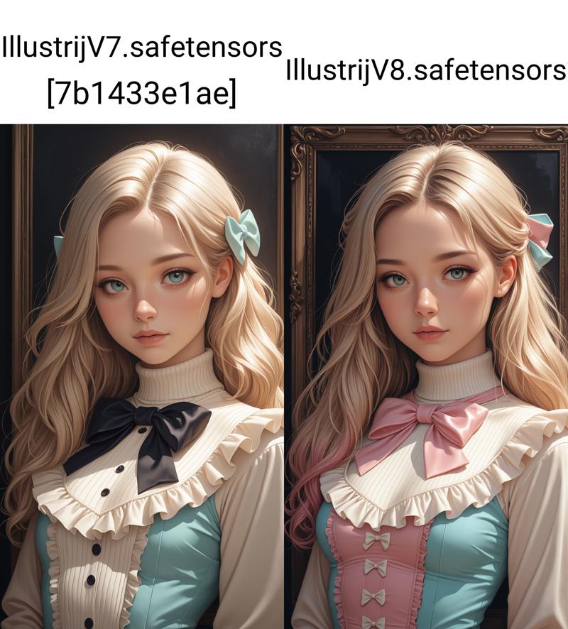
about v8
V8 is an experiment to integrate some of my Loras into Illustrij ~ without triggers of course ;) Let me know if u like the direction and how we can develop Illustrij further. I also tried to ensure that the model's style remained true to itself while leaving out the negative prompt.
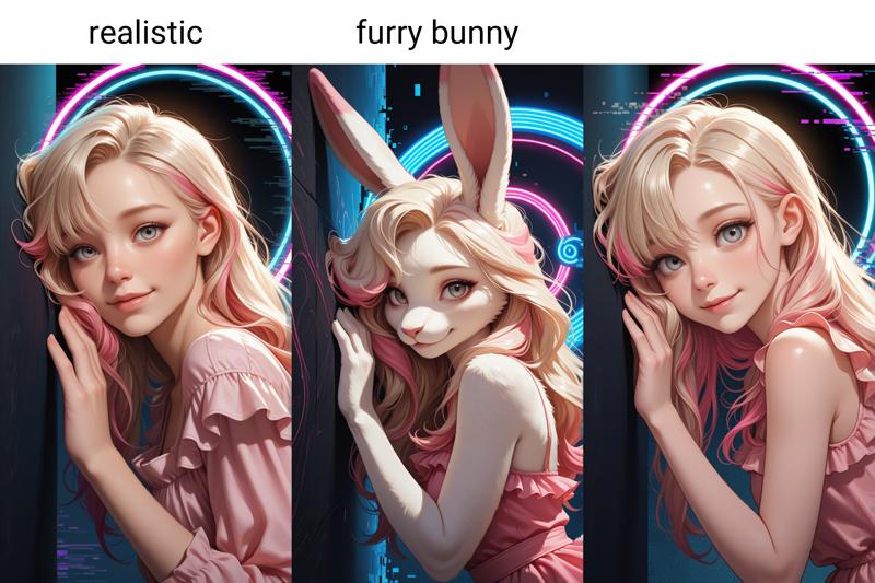
V8 can create furry aswell.
I'm looking forward to ur results and hope u have a lot of fun being creative.
recommended settings:
Euler a / Euler25-30 stepsCFG 5-7Clip skip 2_ might wanna be ur friend for tags☺ Showcase resolution: 720*1280. I would recommend using ADetailer for further distance.
+prompt example
masterpiece,best quality,amazing quality,very aesthetic,absurdres,newest,detailed eyes,-prompt example
u can leave emptyor
worst_quality, bad_quality,a little comparison of V7 and V8
about v7
V7 takes a big step back to the roots and yet somewhere completely different ~ quest: keeping the balance . . . focus on painting a 2.5D lightning effect by drawing the Illustrij faces. I'm curious to see whether u like it and look forward to ur creations ~♥
Please let me know if u like the new direction ☺
recommended settings: 720*1280 / Euler a / CFG 7 / steps 25+ / Clip skip 2
🐰 furry optional
about v6
The new versions spawns with a touch of 2.5 D remdering ~ with a flat-shaded anime style, but subtle 3D lighting and depth, making images look almost tangible.
I hope you like it and stay tuned for your results ~♥
showcase resolution: 1040 x 1510
prompt examples:
Prompting is basically similar to the previous versions. After playn around with and testing old quality prompts ~ at the moment I prefer to use "masterpiece, best quality, amazing quality, very aesthetic, absurd, newest, detailed eyes" or "masterpiece, best quality," for +prompt and "worst quality, bad quality," for -prompt.
Of course these are just examples, u can vary them to suit ur own taste.
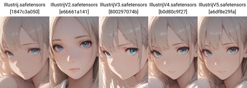
about v5
hey guys, ☺
the gap between v4 and v5 was only a few days ago, but I've been "tinkering around" a bit and didn't want to keep it from you.

Trying to work on getting the quality closer to hires without hires - but there are still a few steps to go ^^
For people who have good hardware and can generally use a lot of Loras etc. at the same time the difference might not be that big, but I feel for the people who have small graphics cards :I
The quality isn't perfect, but I've been working on it a bit ~ soft filling, clean renderings ~ the plan was to create an own style, subtly painted ~ anime-based, but still kissed by reality.

I hope you like the merge and I'm really looking forward to your results ♥
Belonging to the style u prefer u can switch the promptings 4 sure by ur own taste. In general, I mostly use "masterpiece,best quality,amazing quality,very aesthetic,absurdres,newest,detailed eyes" for general quality prompting, and besides depending on whether I want more anime or anime semi 3D touched I am writing "A professional,high-quality,hyper-realistic portrait of a woman, 3D" for the semianime 3D version and "A professional,high-quality portrait of a woman" for anime e.g. or as a conclusion for semi-anime:
"masterpiece, best quality, high resolution, very aesthetic, absurdres, newest, professional, high-quality, hyper-realistic, portrait of a woman, looking at viewer, detailed eyes, realistic body,"
and neg.:
"(lowres:1.2), (worst quality:1.4), (low quality:1.4), (bad anatomy:1.4), multiple views, jpeg artifacts, artist name, censored, young, 2D"
Sometimes I either leave out the negatives completely or write, for example, "lowres, worst "aesthetic, bad quality, worst quality, bad anatomy, sketch, jpeg artifacts, ugly, young, soft rendering, face marks"
depending on whether I use Euler or Euler a as sampler ^^
Usually I structure my prompts based on this:
subject description: who or what can be seen? (what does she/it look like? hair, eyes, clothing, description of the scene),
light and shadow description,
which angle, perspective, motion? quality
and
detailed description
or the quality at the very beginning and then the rest of the structure :)
If u're tasty for more? Here is a lil insight into the prompt structure: https://civarchive.com/articles/10509/il-portreij-step-by-step
about v4
hey guys, ☺
for V4 I changed the recipe a little to improve the quality a tiny bit and also to expand the options for prompts.
about v3
style closer to V1 anime based with a lil qualy upgrade ☺
Showcase images without ADetailer
about v2
a lil more 3D touched without using 3D in promptings
by writing "realistic" the style will become more into semirealism and without its closer to a semianime based style
furry optional
a lil quality upgrade, just a lil ^.^
🌶️ sidefact for NSFW fans: viewer can interact with character by describing what hands can do (see sample images in the showcase)
about v1
If u like the style in the showcase images, u can add
high-resolution, realistic, 3D,
detailed skin, detailed eyes, shadows, dark light, eyelashes, upper body, cheeky, posing, holographic color,
to ur prompt. Without it the style becomes more anime based.
At further distance I would recommend using ADetailer.
Today I can't say yet in which direction the merger is developing, but as a pony and flux fan, I can only say that I love the color intensity of Illustrious. I recently tested it and got a taste for it, maybe you'll like it too ☺
I am happy if u enjoy and stay curious abt ur results ♥
a small comparison from V1 to V5
 ⬆️ masterpiece, best quality, 1girl, face, portrait, looking at viewer, closed mouth, close up
worst quality, bad quality
~~*~*~*~*~*~*~*~*~*~*~*~*~*~*~*~*~*~*~*~*~*~*~*~*~*~*~*~*~*~*~*~*~*~*
I hope it gives a little impression of the development ☺
Description
VAE included
Illustrij V12 baked with Illustrij including Lora 4 a "tiny" quality upgrade ^-^
FAQ
Comments (23)
I have to admit, most of the checkpoints I've been downloading from you, I like them before I even use them because I already know what to expect. I can't wait to give this one a shot. I LOVE this whole rustic cute thing going on with the latest version. You are, without a doubt, one of the more creative contributors to this site.
Thank you very much for the time and care you put into these!🩷 I can't wait to see what you come up with next!
U can't believe how happy I am about ur comment ☺ Thank u so much for writing it ~ it means a lot to me to feel when reading ur lines that u enjoy ur journey with my models, that's exactly why I love AI so much ~ for the spaces of endless possibilities for us to be creative and the best thing is, we can share the fun of it ☺
I really like your models! After upgrading from v8 to v11, I started having trouble using OpenPose ControlNet and regional prompting - the model will not adhere to these inputs very well and ends up generating pretty abstract outputs. Is this something you've encountered?
To be honest, I don't use it at all, so I'm not familiar with it and can't really say anything about it :I
@reijlita Thanks for replying :) Looks like I'll be studying your prompts some more to get a sense of how to pose effectively with just text!
@zerotolerance668 I usually structure my prompts according to the following structure:
+ quality prompt (given as a recommendation in most models)
+ subject description (who? what does he/she/it look like? clothes, hair?
+ motion (pose)
+ facial expression
+ background
+ mood
+ angle.
u can of course swap the order depending on priority, ☺
what i love abt IL is actually that keywords are enough, so simply string together the thoughts that come to ur mind for a pose and let the magic work^.^ If u have a certain pose in mind, but ur not sure abt the tag, u can also ask chatgpt to get the tag or something similar if u like a certain direction ^^
I used version 7 2.5d. It worked well. I tried version 11 updated, I have some problems with the image of the hands, the number of fingers, deformation. The prompt is the same, the prompt indicates the tags for the hands for both positive and negative.
To be honest, that shouldn't be the case. With the newer versions I test several 100 images of hands before I release a model. because I attach particular importance to this. what does ur +pompt and -prompt look like for hands? In most cases, I myself don't use extra prompts for hands because it's not necessary for most models, but can lead to additional errors occurring. If several tags are used for one piece of information, this can be understood differently depending on the interpretation of the model. I just browsed through ur profile. Maybe it's also due to the pony Lora (and possibly the use of scores). Unfortunately, I can't think of anything else because I can't see ur prompts immediately ^^
I just checked again and could read the prompt in last image. So basically I wouldn't use the same prompt for + and -: I Then 5 fingers is a thing in itself, because is it 5 fingers or 4 fingers and a thumb? Therefore I would recommend leaving this part out completely. The best part is that the IL models work with tags, the shorter the part before the “,” the easier the translation is for the model. Important, also pay attention to the gender. If you want to represent one person, but by writing different details here, the greater the probability of getting several people or (the more about the hands there are) several hands. I don't use any pony Loras or scores for IL at all. However, when using SDXL models (with a higher strength, as they only work from 1.5+ in most cases) this usually results in a massive change in the quality of the images.
I remember this from my switch from pony to IL. At IL it is very important to only give a description (including details if desired) of a prompt part. Before i switched to IL, I often used many words and descriptions to represent a gesture, for example. IL reacts differently. IL models are very close to promptings, so every word is able to change the whole image. For example, if the hand should be on the hip and at the same time on the leg and the other on the head, it couldl be difficult for the model to decide where is the hand? on the leg or on the hip or both? It might be a change at the beginning by switching from pony to IL, so I can only recommend using Chatgpt and asking for a tag translation :)
@reijlita thanks for the answer, these tags: five fingers, this is an attempt to fix the situation when errors occur in the number of fingers during generation. I am far from understanding the nuances, because I make images as a hobby, but in this way I tried to draw the attention of the neural network to this area during generation. I just noticed that when I switched to the new version, it started to happen more often, so that the hands came out with more fingers, distorted. Maybe I really don't understand how it works, and I need more experience.
@DeaDWooDEnD The most important thing is that you have fun trying things out. Sometimes switching from one model to another is like getting to know someone; then you see how you get along. ^^ When I first switched to IL, it was a change for me too. You get into the groove if you're open to trying new things. :) My novel was only meant as an attempt to find a solution to figure out what might have been the reason because what you described sounded new to me. I generally only use short negative prompts. With IL, the proximity of the prompts allows you to just experiment and try out whatever keywords come to mind for an idea. And if you want to test old prompts from a different model type, chatgpt is a really great solution for converting your prompts (e.g., from Pony or text form from SDXL) into IL tag form. I hope you have fun being creative. :)
OMG! V12 looks amazing! Can't wait to use it!
thank u very much, curious to see ur creations ☺
Omg this looks amazing
thank u very much ^.^ I am glad if u like Illustrij ☺
I love it!!
thank u very much 4 ur kind comment☺ I am glad if u enjoy generating images with Illustrij^-^
Vraiment magnifique, j'adore
merci pour le charmant commentaire. je suis heureux si tu l'aimes ☺
Hey, any particular reason on why the underscores e.g. "high_quality" instead of "high quality" are recommended for the newer versions? The base model is mostly trained on spaces afaik and iirc there was a comparison somewhere on how spaces do have better results than underscores. Or is this using a finetune model / lora that is specifically trained on them? But even then, wouldn't the lora / finetune be even stronger when having the preferred tags as a 'strong foundation' so to speak? Just curious and overthinking as usual. Thanks for v12, gonna give it a try. <3
We all have different experiences with making prompts and when I remember what I wrote half a year ago... sometimes there were 2x masterpieces in the prompt or different information about one and the same thing, then some of it at the beginning, some in the middle and again at the end of the prompt... if someone had explained it to me like that, I would probably be confused for a moment about what I wanted to say ^^ they are just like little supports around themselves and to show the model what belongs together.
in fact, both can be used. There are loras included but none that require tags. Since everyone has their own idea of good quality, I don't want to include any specifications here either ^^ I create all the images myself, which means that every image that I generate follows a specific prompt construction system. All I've noticed is that, when I use _, the image in my head and the image that is created in interaction with the model are closer together. Every model reacts differently to input prompts, just as we define language differently, even if it's just nuances. The _ is not a necessity, just an option, depending on your taste.
@reijlita Thanks for your response! Yeah, I agree - I know which prompts you are talking about, I tried it a few times but with mixed results, so I did not bother with it again. - Totally! I've played around with v12 a bit and sometimes high_quality seems to yield better results, but on a new seed its the other way around, so getting to a true answer on this might be indeed impossible.
I do think though, that the underscores can be in fact useful for some cases, especially when you want to describe concepts to the model, but the model simply ignores it. Simple example: nose piercing. Usually no model would have problems with that, but with other concepts it could happen, that the model is acting like: 'Oh, I need to create a nose. And a piercing, let me put it on the belly.' :D - so in that case nose_piercing can be really helpful.
Thank you for v12 btw. Nice merge. Would be not averse to a noobAI base at some point, but then again, not sure if required, every model probably has slept with eachother by now anyway. lol
@Amatiramisu Now u've made me smile ~ I think a family tree like that would be difficult too xD I know what I merged into my merges, but the merges I used don't always have origin information^^ but that makes itexciting again. That's why communication is always a little adventure ^^ first finding out how you understand each other :)